WordPress 6.2: A new site editing experience
It’s here, WordPress 6.2 has been released and with this update comes loads of stuff for you to enjoy! Staying true to the format, this release is named after jazz musician Eric Allan Dolphy Jr. WordPress 6.2 “Dolphy” comes with an updated site editor that gives you more control over what your website and pages look like. But there’s also a focus on performance, with this being the first WordPress release that had a performance lead! And lots of other enhancements, like fixes for accessibility issues, PHP8 compatibility and more. Read all about it, right here!
The site editor
WordPress 6.2 comes with lots of new features and improvements to the block editor. Updates to the interface, a better overview of the possibilities and improved blocks. It’s all there for you to discover and take the next step in website editing. And a fun fact, with this WordPress release, the site editor is now officially out of beta! Meaning that the site editor is now more stable than ever.
A new interface for the site editor
The site editor has an updated interface which gives you more control over your site editing experience. It allows you to navigate through your templates and template parts and edit parts of your site in one place. It’s also possible to add a new template or template part by clicking the plus icon next to Templates. This new interface gives you an overview of the templates (for example your 404-page, search results page and archive pages) and template parts (for example your footer or header) to edit.
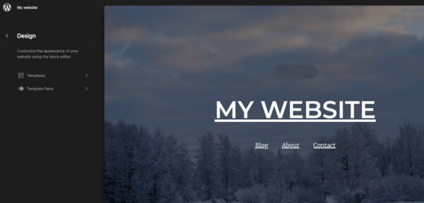
You can find the site editor by going to Appearance in the sidebar and clicking on Editor below that. It’s good to know that the site editor is only available on websites that use a block theme. So if you don’t see the option Editor, you might be using a theme that doesn’t support the site editor.
A smoother experience for the block inserter
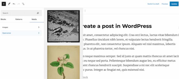
WordPress 6.2 comes with a renewed block inserter, which you can access by clicking the blue plus icon at the top of any page or post you’re editing. The new look feels simpler and we mean that in a good way. You can now use the block inserter to add blocks, patterns and media directly to your content. You can just drag and drop the image of your choice into the page. The block inserter also gives you a preview of the blocks, patterns, or images while keeping the categories in your view. This makes it easier to weigh your options and access the content that you’re looking for.
Another new feature that’s part of the renewed block inserter is the option to add media from OpenVerse. OpenVerse is an extensive media library with over 600 million free, openly licensed images and audio. This can help you find a suitable image (or audio fragment) and import it directly into the page.
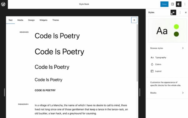
WordPress 6.2 comes with a Style Book
This new version of WordPress comes with a Style Book, which gives you a complete overview of how every block in your site’s library looks. Just click on the Styles icon at the top of your page (next to your Publish/Update button and the Settings icon) and select the style book icon which will show up below that. This makes it easy to change the appearance of the blocks you’re using on your page, for example, the styling of your headings or paragraphs. Having all of this in one place makes it easier to edit all these elements and keep your styling consistent.
Add a sticky block to your page
It’s now possible to keep a block fixed to the top of the page as a site visitor scrolls down your page. Right now, this only works for top-level group blocks. To try it out, simply add a group block to your page or post and you should be able to see the Position tab in the block settings. Select ‘Sticky’ instead of default and this block will become sticky and will stay at the top of the viewport at all times. Kind of cool, right?
An improved navigation block
The navigation block was already available in the block editor but has become a bit easier to use with this latest release. It allows you to add, remove and edit the separate items in your menu in the block settings of your navigation block. You can also drag and drop the menu items to change the order in which they’re shown. You can choose to show an existing menu or create a new one right there (select the menu of your choice by clicking the three dots in the block settings). What’s also cool is that it’s possible to add ‘Search’ to your menu, which adds a search function to your navigation block. There are also other elements you can add, just click the plus icon in the block settings and give it a try!
The introduction of Block Settings and Styles tabs
The options that are being added to Block Settings sidebar keep growing and growing. Which is great, as it gives us more control over the blocks we use on a page. But it was becoming a bit crowded. That’s why WordPress 6.2 is introducing Block Settings and Styles tabs. When a block is selected, the sidebar will show you two tabs, one for the more general settings and one for styles. The latter will show you all the options you have to change the appearance of your block. This will help keep the sidebar more organized and help users understand where they need to be to make changes to the block.
Distraction free mode
The name says it all, this feature helps you work on your page or post with no distractions around. Or at least, any distraction that WordPress can remove for you. Click on the three dots at the top right corner of your page (next to Publish/Update and settings) and select Distraction free to give it a try. This hides all the toolbars that you normally see when you’re working on a page in WordPress. Bringing you some more peace and quiet to focus on your content. If you want to exit the distraction-free mode, just move your mouse to the top of your page and the three dots will appear again (together with your Publish/Update and settings button). This allows you to disable this mode by clicking Distraction free again.
Pro-tip: we also recommend activating Fullscreen mode (which hides your admin UI) for an even cleaner and less distracting screen.

Performance improvements
The performance of your website is essential nowadays. That’s why this update also comes with many performance improvements, visible in the benchmarks for both Web Vitals and Server Timing metrics. The WordPress 6.2 field guide also tells us that performance is further improved for block themes with around 20% faster TTFB (time to first byte, a metric for determining the responsiveness of a web server) and around 14% faster LCP (how long it takes for the largest piece of content to appear on the screen). On pages with hero images, the LCP improvements are even greater at around 19%.
Also good to know: This was the very first WordPress release with a performance lead appointed! The performance lead with this release was Felix Arntz. With a performance lead joining the release team, we can safely assume that performance will continue to be an important part of future WordPress releases.
Under the hood
In addition to performance improvements, there’s a lot of other stuff that’s been worked on which is a little less visible. Let’s dive into a few highlights and show you what’s going on under the hood of WordPress 6.2.
Improved PHP8 compatibility
WordPress aims to support new versions of PHP as much as possible. This means that WordPress Core contributors try to identify any potential compatibility issues and work to prevent these as much as they can. This release isn’t any different. Significant effort has been put toward making WordPress compatible with PHP8 and reducing the risk of WordPress users running into any problems.
Accessibility improvements
We also want to mention that this release of WordPress also comes with a lot of fixes for accessibility bugs and regressions. To give an example, one of the improvements that are part of this release is the realization of more consistent accessibility behavior across different browsers. It might seem like small stuff, but every improvement we make in regard to accessibility is another step towards a web that is accessible for everyone. With no exceptions.
Google fonts in default themes
Default WordPress themes will offer better privacy with Google Fonts now locally included. Beforehand, these fonts were loaded from a remote source (Google Fonts). The themes Twenty Twelve through to Twenty Seventeen now include font files in the theme folder. This update ensures that the themes follow current recommendations for fonts from a privacy perspective, making them GDPR-compliant.
Faster plugin & theme updates
A long, long time ago, WordPress 2.5 introduced copy_dir() for copying a directory from one location to another. However, this method took up a lot of memory, disk space, time and file operations. Which is not ideal at all. Thanks to the introduction of a move_dir function in this release, you will now be able to save time and disk space.
Update to WordPress 6.2
Those were the most important features in the latest release of WordPress, but that doesn’t mean we covered everything. We would recommend updating to this latest version of WordPress and trying it out for yourself! Let us know what you think about all the changes to the block editor in the comments below. We can’t wait to hear about your experiences!
Read more: The WordPress block editor: Why you should be using it »
Source link : Yoast.com


