What Are Footer Links? Why They Matter + Tips
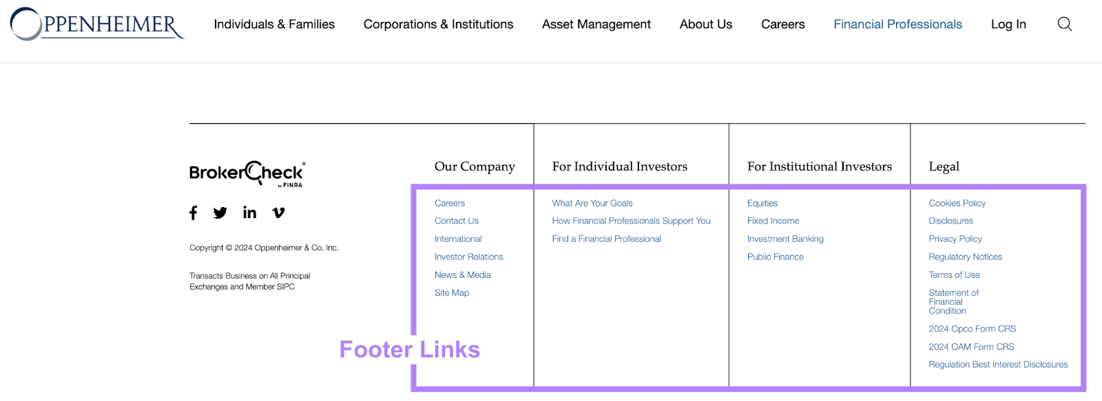
Footer links are the links located in the section of content that appears at the bottom of most pages on your website. This section is known as the footer.
They look like this:

Footer links play an important role in the user experience because they provide visitors with a simple way to navigate to some of your most important pages.
Making it easy for visitors to find what they’re looking for in this way may encourage them to stay on your site for longer.
Using links in your footer won’t drastically impact your search engine optimization (SEO) efforts. But it can play a small role in helping you appear high in search results.
Why?
Because footer links are typically internal links (links that go to other pages on your website). And internal links can help search engines like Google find your important pages and understand how your site is structured.
Carefully implementing footer links can also support a good user experience (UX). And good UX can indirectly help your SEO.
The best practices outlined below can help you provide a better user experience and even boost your visibility in search engines.
1. Include Links to High-Priority Pages
Your footer should only include links to your most important pages to ensure they’re truly providing value.
What makes a page important?
It varies from company to company, but it’s a good idea to include links to content that users might want to reference at any point in their buyer’s journey. Like pages that provide more information or context about your business.
Your footer is also a good place to include links to pages that are important but that might not fit logically within your main navigation. Like your newsroom section or information for investors.
Here are some common places brands link to in their footers:
- About page: The page that summarizes your company, leadership, and unique value proposition (UVP)
- Category pages: Pages that offer an overview of your primary products or services
- Legal information: Legal documentation on disclaimers, terms of service, and privacy policies
- Contact us: Contact information and options to reach out by phone, email, etc.
- Testimonials: A page with stories from past customers who’ve purchased your products or services
- Customer support: A central customer support page or more specific ones like resources, glossaries, tutorial pages, etc.
If you have a larger website, you’ll naturally have more links in your footer. But the user should be able to see the entirety of your footer without it taking up their whole screen (at least on desktop).
Like this:
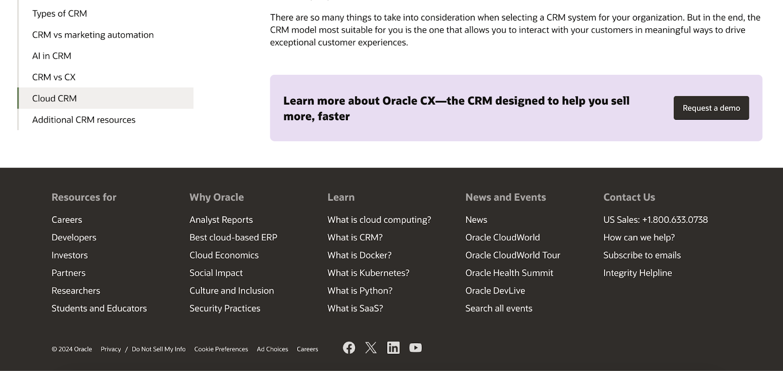
And there isn’t an exact number of links you should include. But make sure you don’t include too many links.
Excessive links (in your footer or anywhere else) can confuse Google about your website’s structure.
Google’s John Mueller stated that too many internal links can do more harm than good. Because excessive links make it harder for search engines to understand the context of individual pages.
So, the best way to tell Google which pages are important is by using your XML sitemap—a file that tells Google which URLs on your site to index (store in its database).
First, use Site Audit to ensure your sitemap doesn’t contain errors.
You can see these by going to the “Issues” tab and entering “sitemap” in the search bar.
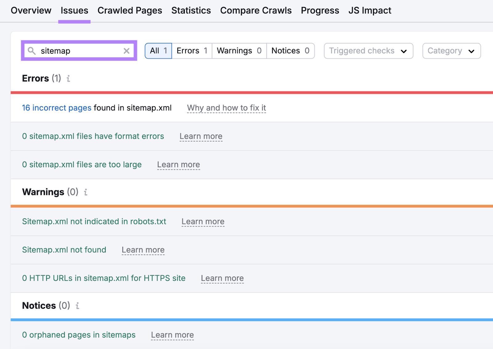
Then, submit your sitemap to Google via Google Search Console.
Your footer links should be organized visually by main topic to make it easier for users to find what they’re looking for.
Vertical columns will make your footer links quicker to scan.
And if you have many links in your footer, you should use headings to organize them.
We organize our footer links in this way:
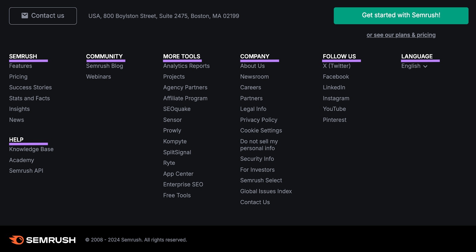
You should also think about the order of your footer links.
Users read from the left to right in most languages. So, put the most important links on the left side of your footer.
For example, we include “Contact us” as the first link. Which gives it more visual prominence that may entice users to click.
Strategically arranging your links like this may even help you drive conversions.
3. Use Descriptive Anchor Text
Anchor text is the clickable text that makes up a hyperlink, and it helps both users and search engines understand what the linked-to content is about.
When choosing anchor text for your footer links, follow Google’s guidelines for all anchor text:
- Be descriptive
- Keep it short
- Confirm the anchor text represents the content of the linked-to page
The anchor text you use in your footer will stay consistent wherever your footer appears. But with other internal links on your site, try to vary your anchor text.
You don’t want to always link to the same pages the same ways. Because that may look like you’re trying to influence rankings.
4. Make Sure Your Website Is Mobile-Friendly
Having a mobile-friendly website is better for rankings overall and ensures your webpage elements (like the footer) are easy to navigate on mobile devices.
With responsive web design, your website will automatically adjust your content to fit the user’s device.
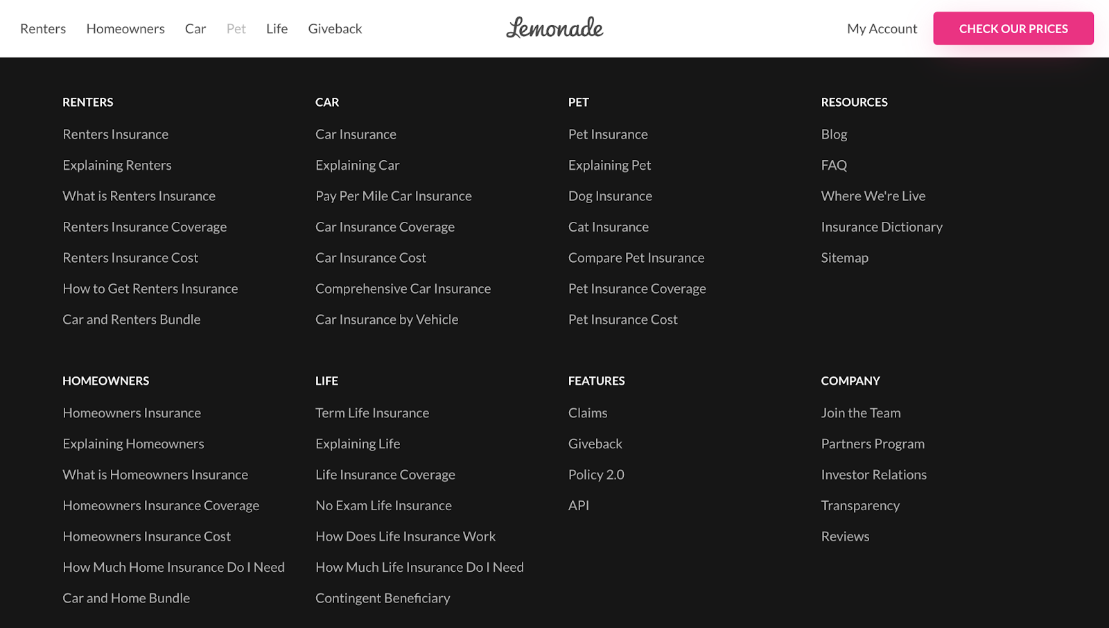
For example, here’s a responsive website’s footer on a desktop device:
And here’s the same footer on mobile:
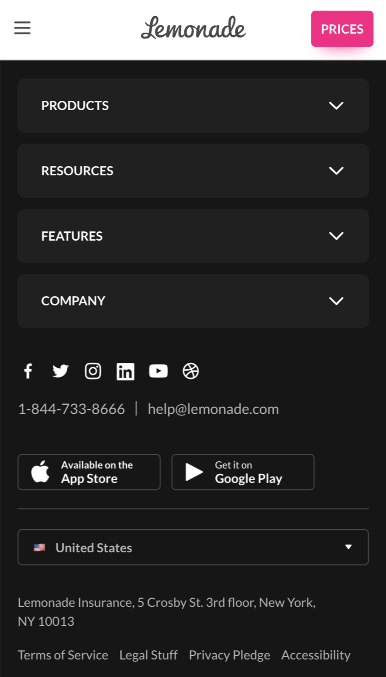
As you can see, the number of columns in the footer is reduced on mobile. And that makes it easier to navigate.
It also adjusted the size and spacing of the hyperlinks. Allowing users to easily click on the footer links using their fingers.
Although your mobile footer may be longer and require more scrolling, it’s more important that links are actually scannable and clickable to make for a better user experience overall.
5. Use Mostly Internal Links
The vast majority of your footer links should be to other pages on your site to encourage visitors to engage with your content and possibly convert.
External links (links that point to other websites) send users elsewhere. And those users may not return.
That said, there are a few types of external links that you might want to include: links to your social media profile pages and to your location(s) in Google Maps.
The right side of the footer is a good place for these external links. Like this:
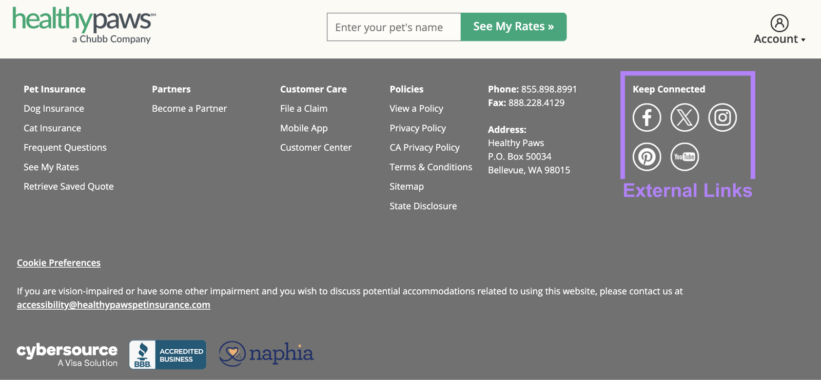
This arrangement makes it likely that users will see your internal links first.
But if they want to visit your social profiles or see where you’re located relative to them, they can easily do so by clicking on the footer links.
6. Add a Call to Action
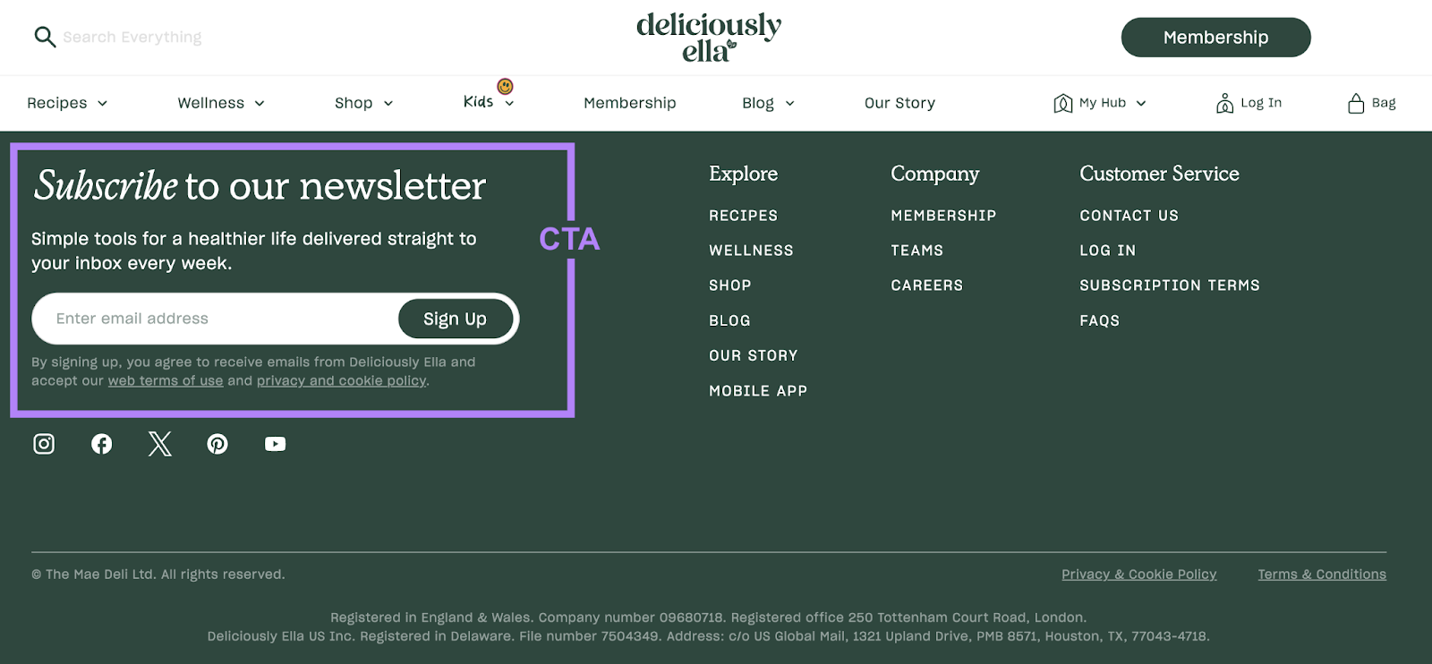
A call to action (CTA) is an invitation for users to take a specific action (submitting a form, subscribing to a newsletter, etc.), and including one in your footer encourages users to complete your desired conversion action.
For example, this website includes a “Subscribe to our newsletter” CTA in the footer and provides a field for the user to do so.
You can also use CTA buttons that direct to conversion-oriented pages when appropriate.
For example, this nonprofit website uses “Contact Us,” “Volunteer” and “Join Our List” as CTAs. And they each link to a relevant page.
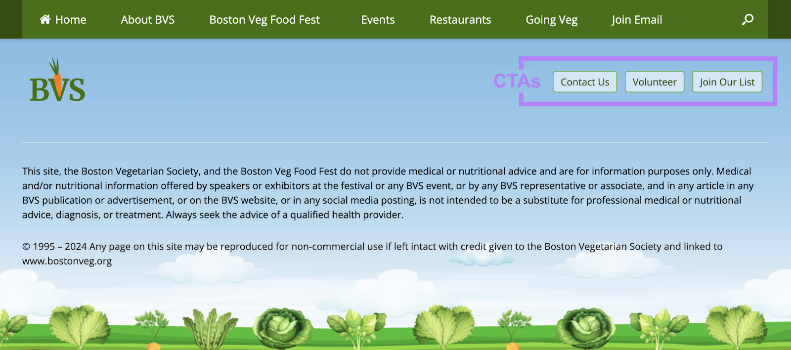
Keep in mind that the footer may be your last chance to capture a click or conversion from your site visitors. So, try to make your CTAs as compelling as possible.
Incorporate Links Effectively
In SEO, footer links should be a part of your overall linking strategy. And it’s important to optimize internal links everywhere on your site.
If you want to check that your website is following linking best practices, use Site Audit.
After you run an audit, find the “Internal Linking,” section of your report and click “View details” within that section.
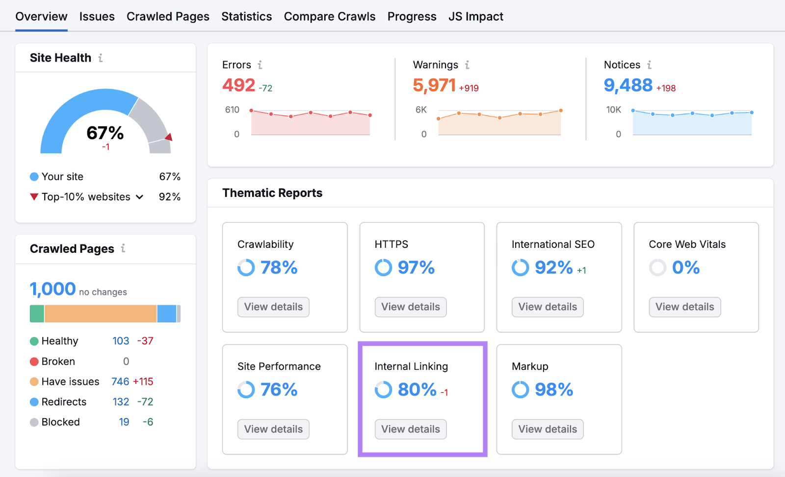
If there are any issues with your links, they’ll be listed in the “Internal Link Issues” table.
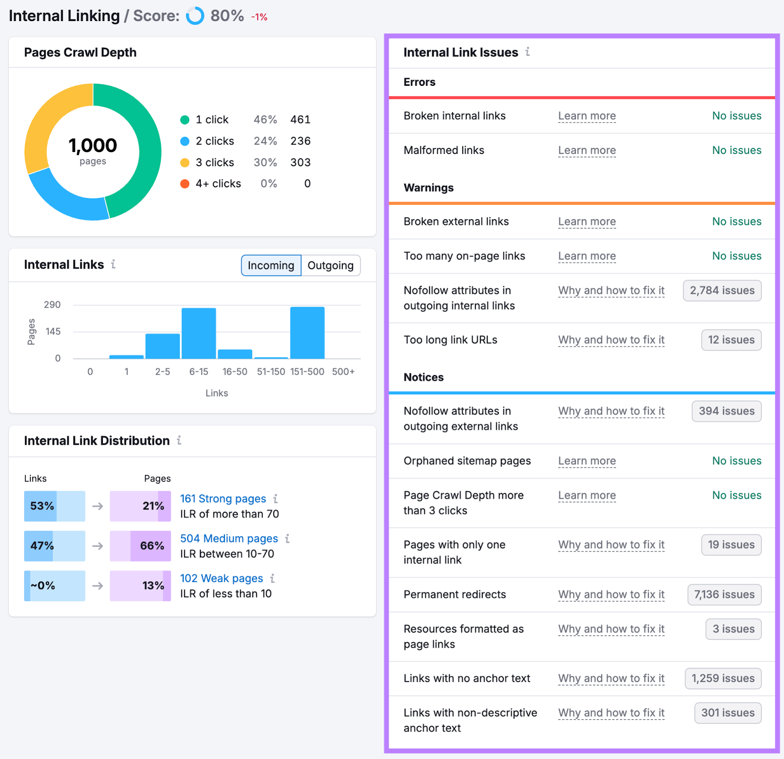
Resolve those issues on your website to improve your linking profile and your overall SEO health.
Source link : Semrush.com


