If you want your brand identity to stick in the hearts and minds of customers, consistency is the #1 ingredient.
Sure, you also need a distinct brand voice, a pleasing color palette, a catchy tagline, and a recognizable logo – but brand consistency lies at the heart of it all.
If your branding is all over the place (i.e., inconsistent colors, wildly different writing styles, etc.), you won’t stand a chance of cutting through the noise to build a loyal following.
But how can you ensure your brand elements remain consistent across the board?
After all, you’ll likely have quite a few people creating content for your brand, including writers, graphic designers, editors, web developers, and others – so how do you keep them all on the same page?
Enter the brand style guide, a necessity for any business wanting to maintain a consistent brand personality across multiple channels, such as its social media profiles, marketing content, and videos.
Your style guide contains all your brand guidelines, including preferences for typography, brand colors, writing style, visual elements, and more. It’s the document that unifies your content creation team and freelancers under the same umbrella to ensure your brand’s tone of voice & visual identity remain consistent.
Do you have your own style guide for your company?
If not, you’ve come to the right place. Stick around to learn how you can create a detailed brand style guide from scratch.
Why Style Guides Matter
Creating an in-depth brand style guide is a critical step to take before rolling out a content strategy.
That’s because your branded content needs to remain consistent with your brand identity in order to build and maintain an audience.
A style guide clearly defines your set of standards for typeface, grammar, tone of voice, logo, colors, visuals, word choice, and more. It’s a document that you need to send to your in-house content creation team, all freelancers that will create content for you, and the rest of your employees.
It’s imperative that your entire staff get familiar with your brand style guide, especially the part that covers your mission statement and brand story.
The best brands out there all have style guides they use at their organization, from Skype to Mailchimp and beyond.
Without a style guide, your content creators may use incorrect colors, use words you don’t care for, and upload an outdated version of your logo. That will provide an inconsistent brand experience that will hurt your reputation and may even turn off potential customers, which is why style guides are so essential.
Style guides are all about ensuring the content you release is polished, consistent, and ultimately more enjoyable for readers.
If you remain consistent with all your content efforts, your customers will come to expect a certain degree of quality & excellence from your brand – which can help you obtain thought leader status and elicit loyalty from your customer base.
Where to find style guide templates
If you aren’t sure where to start with your style guide, you can always make use of a template.
Our recommendation?
Instead of opting for a generic style guide template, try emulating style guides from the most successful companies online.
For instance, Netflix has a simple style guide that you can easily adopt for your own brand. In particular, it covers how content creators are to use their brand assets, primarily their signature logo. 
It’s easy to find the style guide for just about any company if you do a quick search for it – so don’t be shy about looking up the style guides for the businesses that inspire you the most.
What Elements Should You Include in Your Style Guide?
Quite a bit should go into your style guide, including your standards for written & visual content, your mission statement, logo guidelines, and more.
Accordingly, you may not know what to include in your brand book if you’ve never compiled a style guide before.
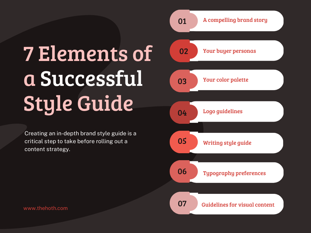
That’s why we’ve put together the 7 core elements of a successful style guide.

Element #1: A compelling brand story
First, every style guide should include a concise brand story that summarizes your values, mission statement, and vision in one neat little package.
Every successful brand in history has had a clear & concise mission statement and a story that connects with and inspires its audience.
What makes your company tick? What do you hope to achieve in the future? What sets you apart from the dozens of other companies in your industry?
These are all essential questions to ask yourself when developing your brand story.
Also, while using a few brand archetypes here and there is okay, the best thing you can do is inject a bit of your personality and eccentricities into your brand story.
The last thing you want is for your employees & content creators to skip over your brand story because it’s dull and predictable. To avoid this issue, try sprucing up your brand story with a bit of humor, fun illustrations, and a down-to-earth tone.
The team at Skype fully understands this, which is why their brand story features fun visuals and a concise, informal tone.
Trello also has a fantastic brand story in its style guide, featuring 10 of the company’s guiding principles, along with custom illustrations for visual appeal.
Your entire style guide should adopt a similar format, where you convey information in brief paragraphs, bulleted lists, and include lots of images. That will make your style guide highly readable for users, which will increase the chances of them retaining your brand guidelines.
Element #2: Your buyer personas
A buyer persona is a fictional representation of your typical customer. It’s a detailed profile complete with a unique name, hobbies, buying habits, job title, age, gender, and primary challenges.
Why is it important to include buyer persona information in your style guide?
It is because your buyer personas (it’s possible to have more than one) represent the target audience you’re creating content for, which is invaluable to content creators.
Your bloggers will want to know who they’re talking to in their posts, which is where your buyer persona information comes in handy. It will clue your writers in on the appropriate tone of voice, word choice, and paragraph structure to use in their articles.
Your buyer personas will also inform your video content, infographics, and all other forms of on-brand content that you release.
If you haven’t created a buyer persona yet, check out our detailed guide on how to develop one.
Your buyer persona is a testament to how well you know your target audience, so you should do considerable research on them before creating a persona/avatar.
Make sure you dedicate at least an entire page of your style guide to your buyer persona, and you can even include details like a profile picture and a fictional home address to make your personas feel even more real.
Element #3: Your color palette
This element is especially important for your web developers and graphic designers. Your color palette refers to the specific group of colors you use for your brand & logo.
To maintain consistency, you’ll need to use the same color codes for every blog post, video, infographic, landing page, and guest post that you produce. As such, including the specific HEX or RGB color codes in your style guide is an absolute must for color consistency.
The most recognizable brands tend to stick with no more than 4 main colors for their branded imaging.
That ensures that you don’t stray too far from the original hues of your logo while providing enough wiggle room for displaying your logo on light & dark backgrounds.
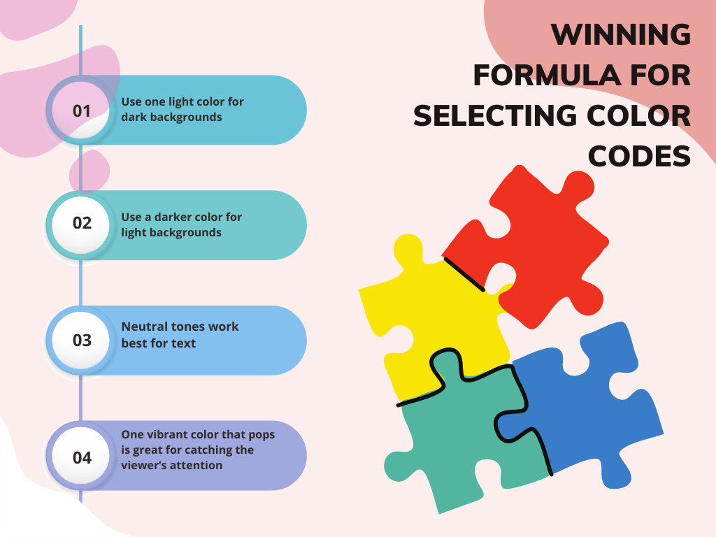
Here’s a winning formula for selecting color codes:
- Use one light color for dark backgrounds
- Use a darker color for light backgrounds
- Neutral tones work best for text
- One vibrant color that pops is great for catching the viewer’s attention

That will give you 4 color codes to include in your style guide, which is more than enough.
When listing your brand colors, include the following information:
- Pantone Color System (PMS) number
- CMYK color code for print color
- HEX & RGB codes for digital color
Including these three codes will ensure your brand colors remain consistent regardless of the medium they appear in, such as printed ads & online content.
Element #4: Logo guidelines
Next, it’s crucial to include your standards for displaying your branded logo.
The most recognizable brands in the world understand the importance of this step, which is why their style guides go into such rigorous detail about how to use their logos.
As an example, Facebook has several pages of its style guide dedicated to displaying its logo, including how much space to leave around it.
Why is that?
It’s because they want to ensure their logo always has a strong visual impact, and that can’t happen if it doesn’t have enough room to breathe – hence the specifications for how much space to leave around it.
Facebook isn’t the only brand that sets ‘exclusion zone’ rules for its logo, as many other mainstream brands also have similar standards.
You should take a page out of their book and make sure there’s always at least some space left between your logo and the rest of the webpage/printed ad (most brands stick with using half the width of the logo as the standard).
Also, don’t forget to include specific color codes for your logo in this section as well.
Element #5: Writing style guide
This section of your style guide is all about ensuring the consistency of your brand’s copywriting. Feel free to get as specific as you’d like here, as it’s up to you to develop a unique voice for your brand.
Of course, you should adopt a tone that resonates with your target audience. For instance, if your brand deals with highly professional clients, a loose, informal tone might not be the right way to go.
Whatever writing style you choose for your brand, your style guide is where you set the rules in stone.
Are there certain phrases or terms you don’t want to be associated with your brand? Do you follow the MLA writing style? How do you want writers to handle the capitalization of headings and article titles? Do you follow APA’s guidelines for citing sources?
You’ll need to answer each of these questions in this section of the style guide, as well as include any other specific rules you want to set.
It’s also smart to include a few successful examples of your preferred writing style in action, either by linking to one of your existing posts or a competitor article that you admire. These will help your writers get a stronger grasp of the type of brand voice you want to achieve with your content.
Pro tip: Are there any competing brands that you don’t want your writers to mention? Be sure to list all the brands here to save yourself from having to make countless edits down the line.
Element #6: Typography preferences
Your standards for typography are equally as important as your color palette, logo, and writing style.
What’s typography?
It refers to the fonts, typeface, sizing, and centering preferences you have for your text. If you pay attention to copy released by mainstream brands, you’ll soon notice they always use the same group of fonts and text sizes.
Your goal with your typography should be to create a visual style that’s not only appealing but also easy to read. That will make your content more accessible to a wider audience, which will help build your brand.
You can choose to use a single font or a multitude of fonts for your content; just be sure to include them all in your style guide.
It’s best to designate specific typefaces for headings, captions, and body content to ensure it all has a unique look and stands out. Also, include whether you want your writers to always align left, right, or center.
Element #7: Guidelines for visual content
Lastly, you need to dedicate a section to how you want your visual content to look, which includes both images and videos.
If you’re going to have your writers select images for you, then you’ll need to include guidelines for image selection. For instance, you may prefer landscape-style photos that are free to license, or you may want writers to use custom images from your library.
Your videographers and photographers will also need to know your logo color codes, preferred fonts, and buyer persona information.
For videos, get specific with which type of video codecs you want videographers to submit, such as .mov or .mpeg. You should also specify your preferred resolution for videos, such as 1080P or 4K.
Do you want your videos to feature stock music, or are you okay with licensing specific songs?
Music is another aspect to include in your style guide, so don’t forget to include your preferences for audio.
Tips for Creating a Style Guide
Now that you know what to include in your brand’s style guide, it’s time to learn how to develop one from scratch.
Here are some tips for perfecting your style guide.
Gather inspiring photos and materials
You need a clear vision to develop a style for your brand, which is why you need to begin gathering photos and materials that inspire you.
Which competitor blog posts do you feel really knock it out of the park?
Use them as a reference for the writing style you want for your brand. Pictures are also extremely helpful when creating a brand voice, so take to Google Images and Pinterest to find inspiration.
You can use images to represent your company’s core values, mission, and vision for the future, which will help refine your brand’s voice.
Create a detailed outline for your guide
You shouldn’t start writing your style guide without creating an outline first, as it will make the entire process easier.
Writing an outline should be a breeze, as all you have to do is list the 7 elements that we defined above – all while including any business-specific needs you have.
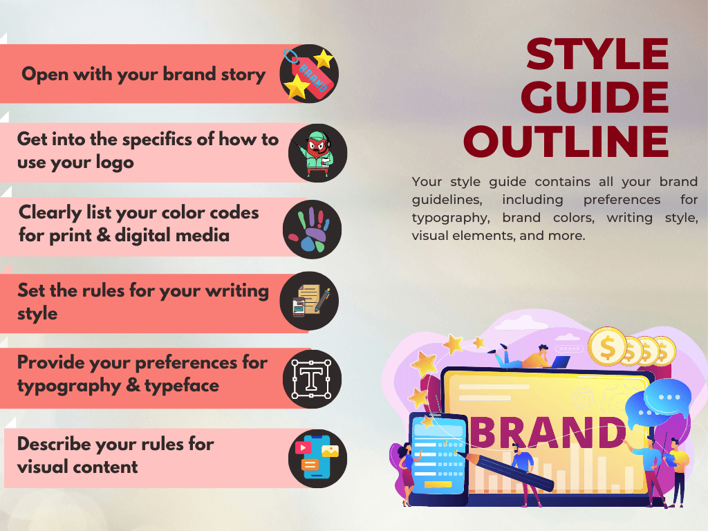
A style guide outline should look something like this:
- Open with your brand story
- Outline your buyer personas
- Get into the specifics of how to use your logo
- Clearly list your color codes for print & digital media
- Set the rules for your writing style
- Provide your preferences for typography & typeface
- Describe your rules for visual content

An outline like this will make it far easier to create a fully fleshed-out style guide.
Plan ahead for the future
Your style guide shouldn’t be a one-off venture. Instead, it should be a living, breathing document that continues to change & evolve with your company.
We recommend keeping a section of your style guide to contain your new ideas. That way, whenever it’s time to review & update your guide, you’ll have a fresh list of ideas to include in its new version.
As long as you continue to revisit your style guide periodically, your branded content will remain relevant & consistent.
Final Thoughts: Is Your Brand Style Guide Complete?
Your style guide is the one document that will ensure total consistency for all your branded content, which is why it’s so critical to have one for your business.
If your style guide is currently lacking one of the 7 crucial elements listed in this post, it’s time to update it accordingly.
With a fully fleshed-out style guide, your content marketing strategy will significantly boost your brand awareness.
Do you need help with the content strategy at your business?
Then you need to check out our HOTH Managed Content service and our top-tier content creation services at HOTH Blogger.


