Posted by
Mordy Oberstein

The data and overall consensus point to Google’s December 2020 Core Update is it’s one of the more impactful algorithm adjustments to hit the SERP over the past year or so.
As powerful as the update was, wouldn’t it be nice to know what happened? What did Google change? What were they looking for? Why did some sites win while others saw ranking losses?
These are great questions and if you want exact answers, there aren’t any.
This is not a post to showcase the precise nature of the December 2020 update. This is a post that attempts to find themes within the update by qualitatively analyzing some of the pages Google swapped out on the SERP.
How I Approach Google’s Core Updates
A lot of what we consume around core updates tends to try to put the insights in front of us on a silver platter. Whether it be data on which niches were impacted by an update or which sites won/lost the most, we’re not often given much in terms of methodology. Heck, most of us don’t even have access to that type of data so we couldn’t rummage for insights even if we wanted to. (Not that this sort of data isn’t helpful, it surely is.)
What I’d like to do before I get into the cases I looked at is to offer something on how I go about fishing for insights. It’s a method that I think the average SEO can undertake. Discussing my approach will also help delineate the limitations of what I have to say here because it is far from being the gospel.
There are a lot of ways to approach Google’s core algorithm updates and each has its own degree of validity. For me personally, I prefer to look at core updates almost from a pure content and UX perspective. For me, it’s about the specific pages Google swaps out more than it is a per domain analysis. Is that to say this is the only approach? Certainly not. Can the impact of an update be at the domain level? Most definitely.
In other words, I am performing a qualitative analysis, and while I looked at far more examples than what I will show here, we are not talking about the evaluation of thousands of data points. Again, this is more like a case study.
Simply, I am not making any sort of definitive statements. The analysis that is forthcoming is merely how I see things based on my own evaluations.
The Approach to Core Updates
What exactly did I do and what do I generally do when trying to analyze a core update? In a nutshell, I look for themes. How? By digging into the impact of the update at the page level. What I want to know is, why did Google swap one page for another on the SERP? That means looking at pages that seem to have some sort of relationship.
Now, that doesn’t always mean that Google moved a page out of the 5th position on the SERP and replaced another page at that very same position. It’s more a general ranking “relationship” – page A lost rankings and page B was put into that general “vicinity” on the SERP.
Once I see a relationship between the pages I analyze them from a content perspective. Again, that is not the only way to look at the pages, but it’s how I do it. What content is on one page versus the other? What audiences are the pages targeting? Are they going after the same intent? How specific is one page over the other? What tone does each page take? How are the pages formatted? What are these pages linking to? Is a page nudging the user towards a conversation more strongly than the other?
I can’t possibly list every single question I ask, a lot of it is intuition after seeing so many cases and then trying to concretize things.
What moves me, however, is when I look at 100 keywords I start seeing the same content-oriented theme arise again and again.
The following is what I saw during the December 2020 Core Update.
Analysis and Insights on the December 2020 Core Update
What I did here was to take a few examples of one page being replaced by another page for a specific keyword and look for a discrepancy between them. The examples I will show here reflect my analysis of a larger set of keywords (about 100), among which were many other examples that reflect similar themes. In other words, I am presenting these cases because I feel they speak to an undercurrent or a theme within the December 2020 Core Update.
1. Best Retirement Plan
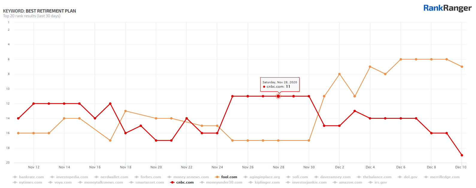
Winner: The Motley Fool:
Loser: CNBC:
The CNBC page is literally an “ultimate guide to retirement planning.” It’s full, it’s robust, it’s good, it’s detailed, and more. So why didn’t Google like it?
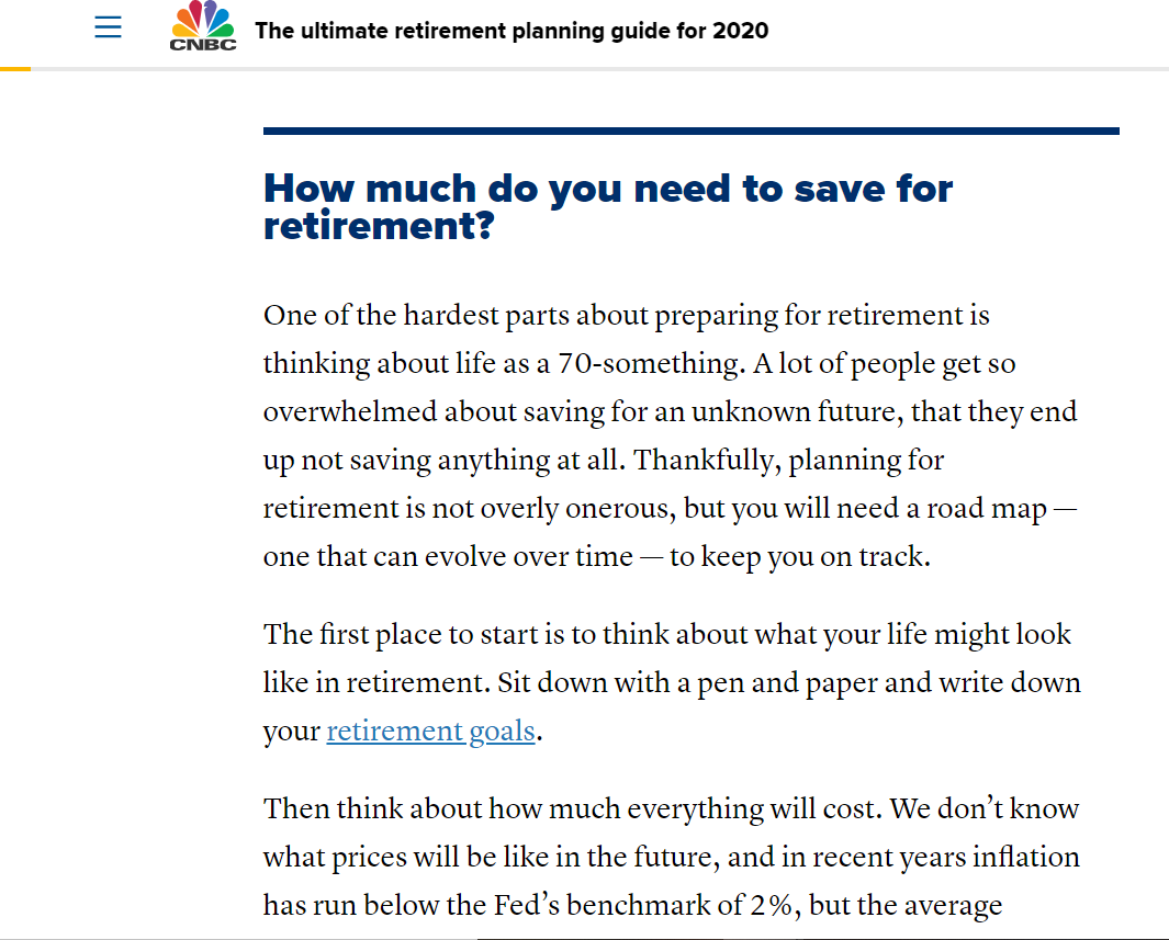
To start, let’s have a look at the page. After a bit of an intro, the page starts with a look at how much money you need to retire:
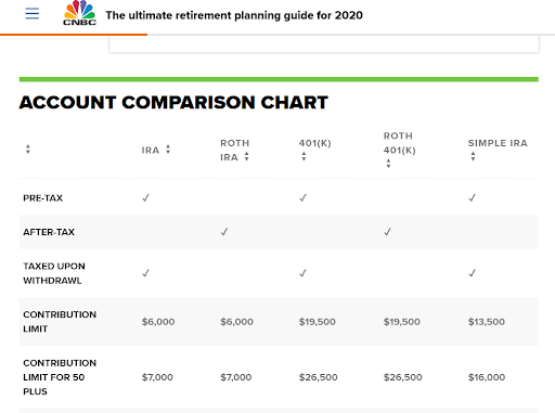
The page then gets into how to start saving for a retirement plan and offers a chart comparing various retirement account types:
Then we get a write-up on the various accounts and what they mean for your retirement:
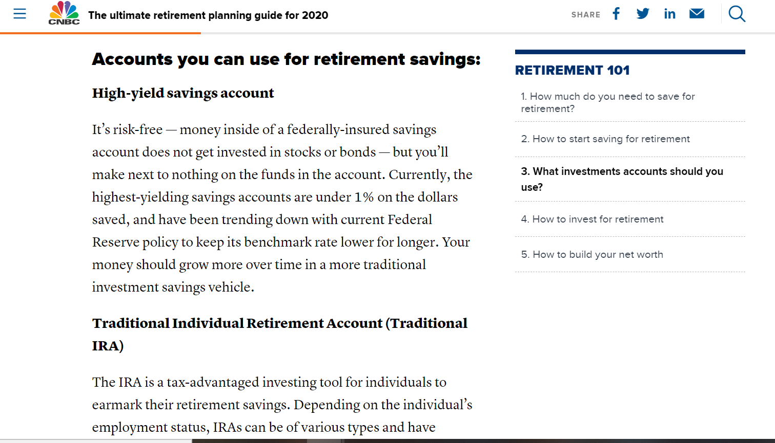
I could keep going, but if you look at the image above, you can see the page goes into how to invest and how to build your net worth as well (see the menu to the right of the page’s main content).
So, what’s the problem here?
I think that’s the wrong question. There’s nothing wrong with this page. The question is, what does the page from the Motley Fool do better?
Let’s dive in.
This page, unlike the CNBC page, dives right into the various retirement plan options:
Moreover, throughout the page, the Motley Fool utilizes formatting that makes it really easy to digest the content:
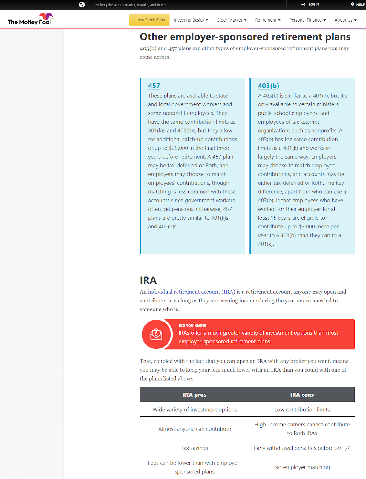
The Moral of the Story: Think about who’s searching for this query. Is it some sort of absurdly and astutely aware person who can easily assimilate an abundance of financial information?
Probably not.
It’s probably your average person who just woke up and realized they will need some money to live on once they stop working.
Which page is better for your average person and which is better for a person who is “into these sort of things” to begin with?
If I were a very financially savvy person or even someone who was “into” the world of investment, then maybe the more prolific CNBC page would be my personal choice.
Personally, I am not that user, I find the more targeted content (i.e., content that only relates to my specific question) more suitable. Add on the fact that the formatting makes it really digestible and easy to assimilate complex information and I’m all-in on the Motley Fool’s page if I was searching for this term.
What I’m trying to say, and as you’ll see in the examples I will get into later, is that the content that was more focused on the specific topic mentioned in the query did better. So while the “ultimate guide” here did get to the topic the query deals with, it was not exclusively about that topic.
This might call the entire strategy of creating these ultimate guides into question. Perhaps you can’t cast a wide net in that way anymore? Perhaps, the “ultimate guide” is only really suitable for people who actually want to get a more broad understanding of a topic? (Crazy to think, I know!)
2. How Much Down Payment to Get Mortgage
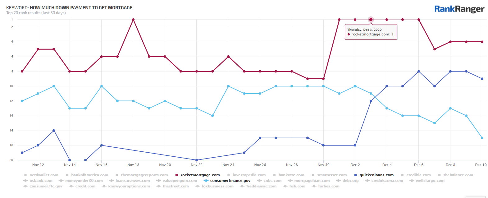
Winners:
Rocket Mortgage
Quicken Loans:
Loser:
What’s obviously interesting here is that the .gov top-level domain lost out to two very commercial sites! How can that be?
It’s very similar to what I saw in the case I talked about above. The CFPB’s page is a wonderful page. It’s a great page. However, it might not be the best page for this query.
Like the CNBC page we saw, this one also offers what is the equivalent of an ‘ultimate guide’:
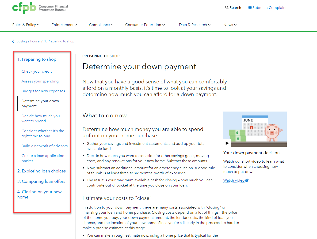
Information on the down payment is the fourth discussion point on this page. If that’s all you’re here for, then you need to do a lot of scrolling to get to the content that is relevant to you.
This is not a page about down payments. At a certain point, the page talks about setting aside enough money for your other investment goals!
It’s not a page about how much you need to set aside for a down payment on a house.
The pages from Rocket Mortgage, on the other hand, is only about how much you need for a down payment:
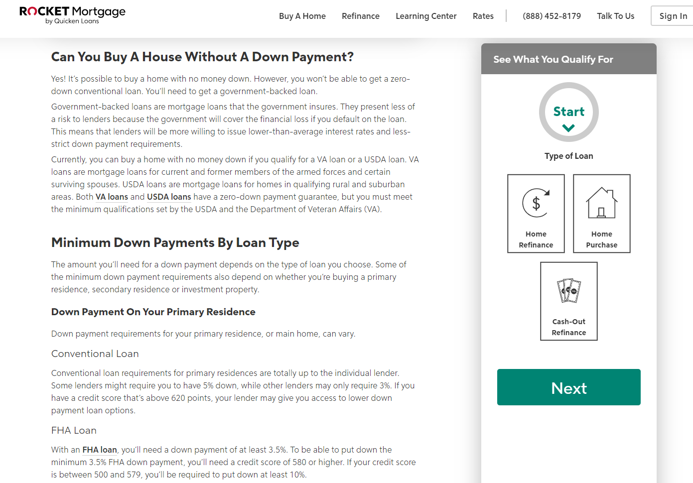
So too is the page from Quicken Loans:

The Moral of the Story: If I want to understand how much money on average I need to put down when buying a house or what the various options generally are and what they mean long term, the CFPG page, .gov or not, doesn’t really help me. Its content is not specifically honed in on that particular topic. Again, we have another page that takes a sweeping look at a topic that lost rankings when the query reflected a more specific sort of intent!
3. How To Get Out of Credit Card Debt
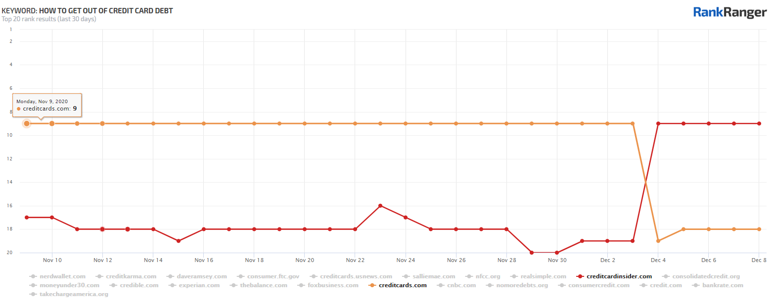
Loser: CreditCards.com: https://www.creditcards.com/credit-card-news/help/8-steps-cut-credit-card-debt-6000/
I like this case for two reasons:
- It’s an exact page swap. One page replaced the other at the same ranking position.
- It shows the same concept as the earlier examples I gave, but from the opposite perspective.
Let’s take the page from CreditCards.com first. Unlike the previous examples I showed, this page is all about the topic reflected in the query. That is, 100% of the content is specifically about getting out of credit card debt as you can see here:
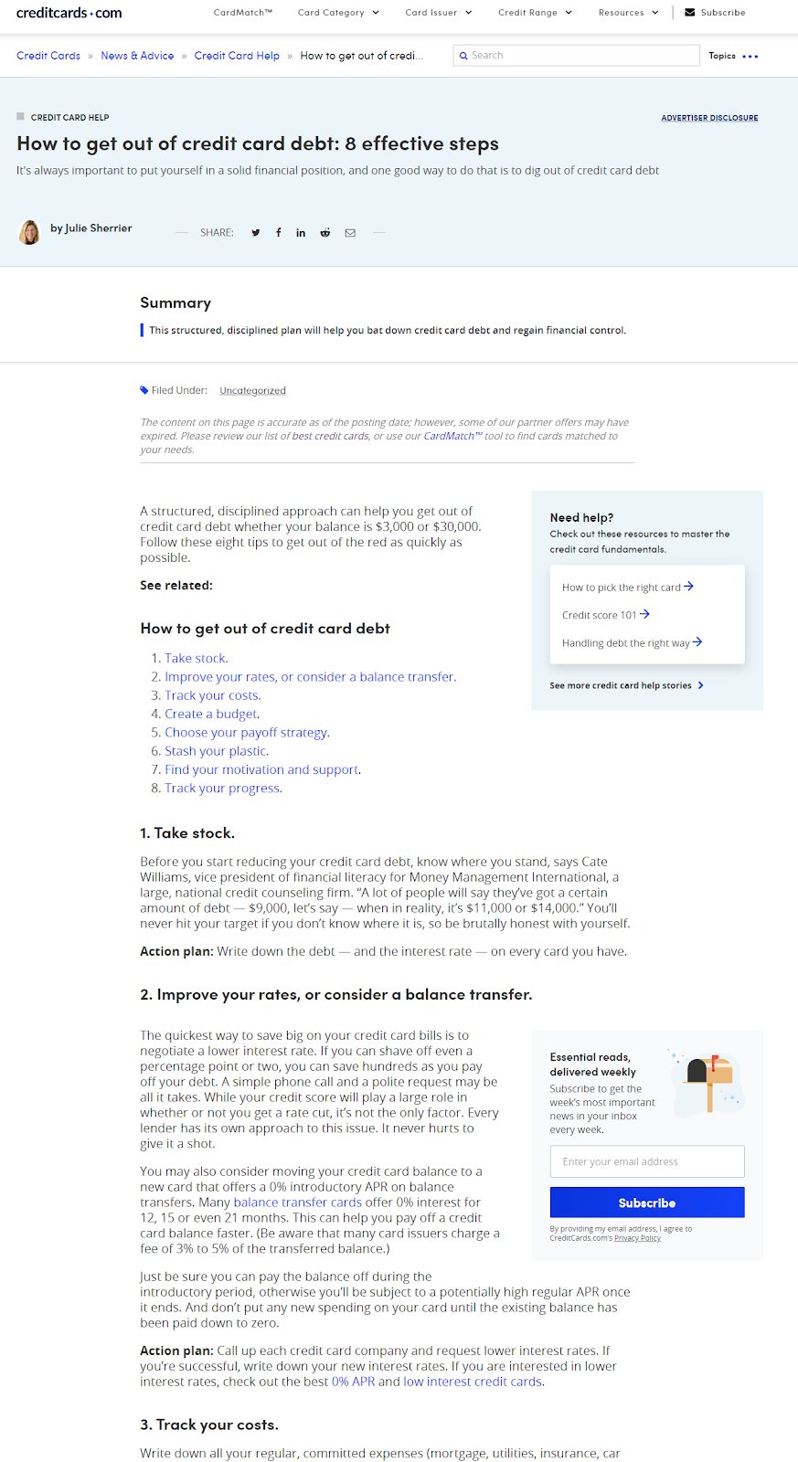
What’s interesting here is that unlike the previous examples, where too much content resulted in the page’s topical relevance being diluted, the lack of such content here is what I think caused the ranking loss.
Look, it’s not bad content. However, it’s pretty much the “general” kind of content you see here, there, and everywhere for all sorts of topics.
Just compare it to what the page from the Credit Card Insider offers:
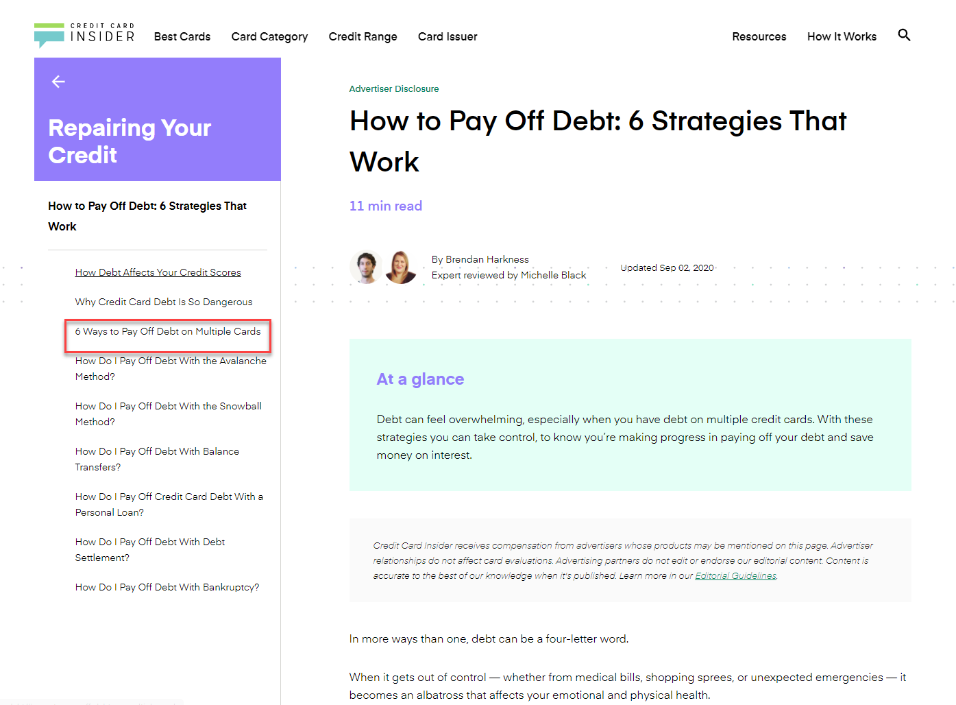
This just oozes depth. The third topic on the page alone (6 Ways to Pay Off…) rivals the depth shown on the CreditCards.com page!
What differentiates this page from the “guides” shown in the other examples is that this is a guide that drills deep into one topic as opposed to trying to span multiple subtopics.
Also, have a look at the formatting, it reminds me of what we saw on the Motley Fool’s page:
It’s deep content that is easy to digest. It’s not hard to see why Google swapped these two pages.
The Moral of the Story: Exact content relevancy is not only about what topic you talk about. You can be topically aligned but it has to offer real information to the user. It’s even better when that information is digestible. In other words, if you want to rank for a keyword with topic specificity it might be better to create an “ultimate guide” that drills deep into the topic itself versus trying to cover every subtopic under the sun in order to try to rank for more topics with one piece of content.
4. Can I Get Addicted to Pain Killers
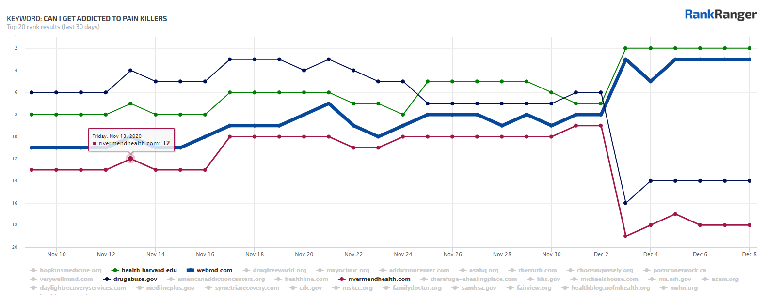
Winners:
WebdMD:
https://www.webmd.com/mental-health/addiction/painkillers-and-addiction-narcotic-abuse#1
Losers:
RiverMend Health:
https://www.rivermendhealth.com/resources/distinguishing-pain-related-dependence-addiction/
National Institute on **** Abuse:
This is another great example. Not only do we again have a .gov losing rankings but all four sites started off ranking together in a cluster.
So, what happened here?
Let’s start with the RiverMend Health page:
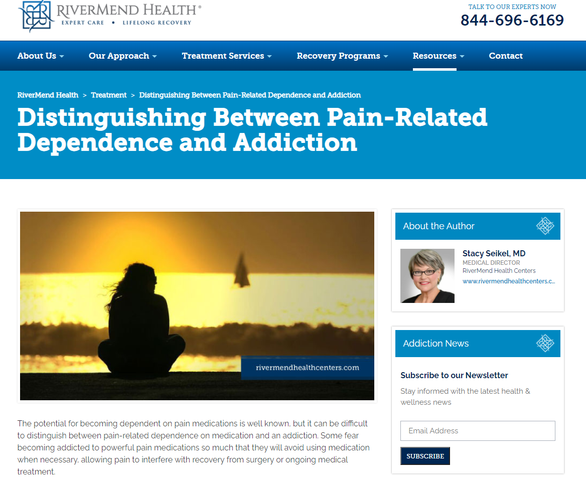
It’s really excellent content that’s written by a medical professional, what can be so bad? And again, the answer is nothing… if you want to learn about the difference between pain-related dependence relative to addiction per se.
Compare this to the page from Harvard Health:
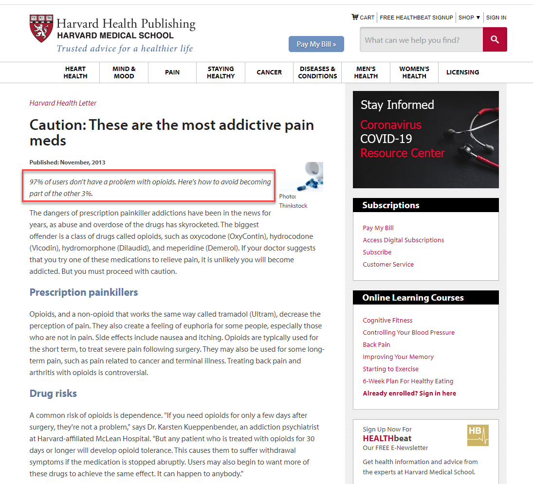
The by-line really sums it up. It tells you this article is about the fact that you most likely won’t get addicted to painkillers, but it’s definitely possible so here’s the scoop.
To me, it’s far more in line with the average user’s intent of learning about the risks of addiction versus understanding the fine difference between addiction and dependence.
It’s the same story with the WebMD page:
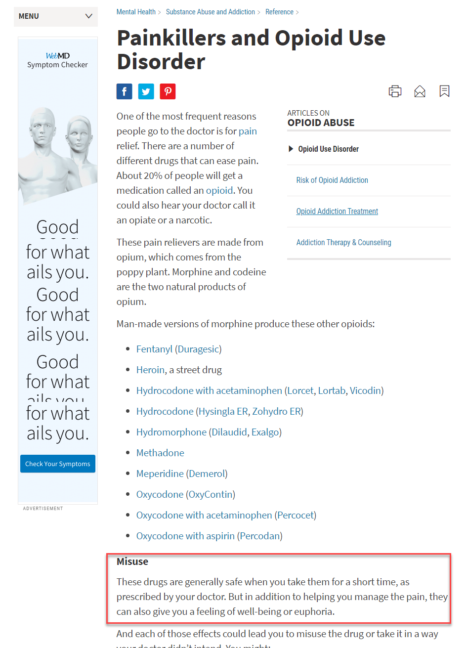
You get content that is specifically about understanding what the situation around painkillers and abuse is.
OK, but what about the page from the NIH? You can’t get more authoritative than the NIH! That’s true. And there’s a lot of great content around the issue of painkillers and addiction on the NIH page. However, there’s also content about things like taking painkillers while pregnant:
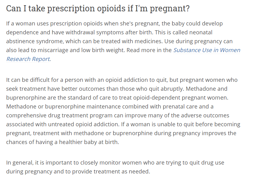
The Moral of the Story: Again, the issue here is not how authoritative or how substantial the content is. There is no doubt that content from the NIH is both substantial and authoritative. The issue here again seems to relate to Google being better able to show content that is specifically relevant to the nature of the query.
5. How to Tell If You Have Depression
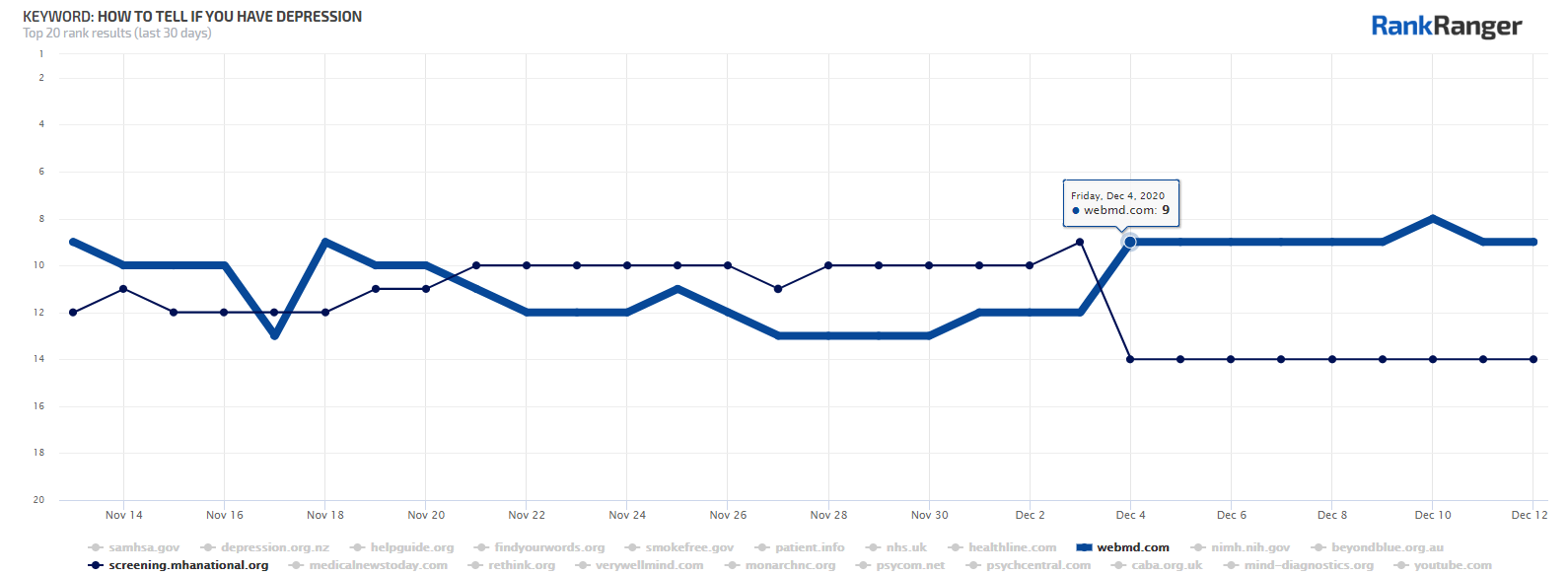
Winner:
WebMD:
Loser:
MHA:
This one really isn’t that complicated, at least to me. It is, however, a great example of how relevancy and authority go hand-in-hand.
Let’s start with the page from MHA:
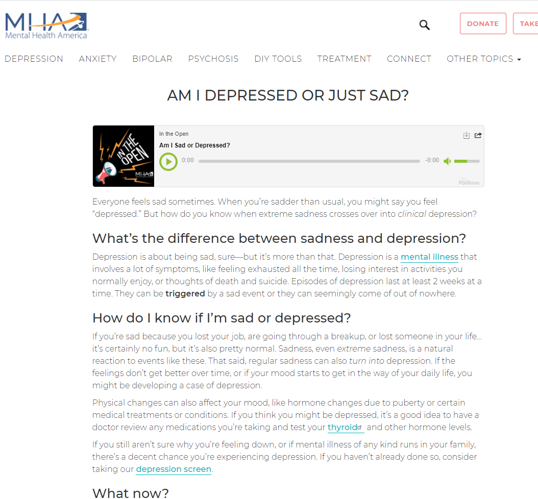
First things first, the page doesn’t speak to the query directly. While in the process of learning the difference between sadness and depression one could understand the signs of depression that route is certainly indirect.
You could argue that the query how to tell if you have depression could be taken as ‘how do I know if I am just sad or depressed?’ but that really doesn’t seem to be the essential intent here. That topical line (i.e., sadness vs. depression) would most likely produce its own unique query (i.e., am I sad or depressed).
From the content shown on the WebMD page, it appears that Google thinks of the intent as understanding the symptoms of depression:
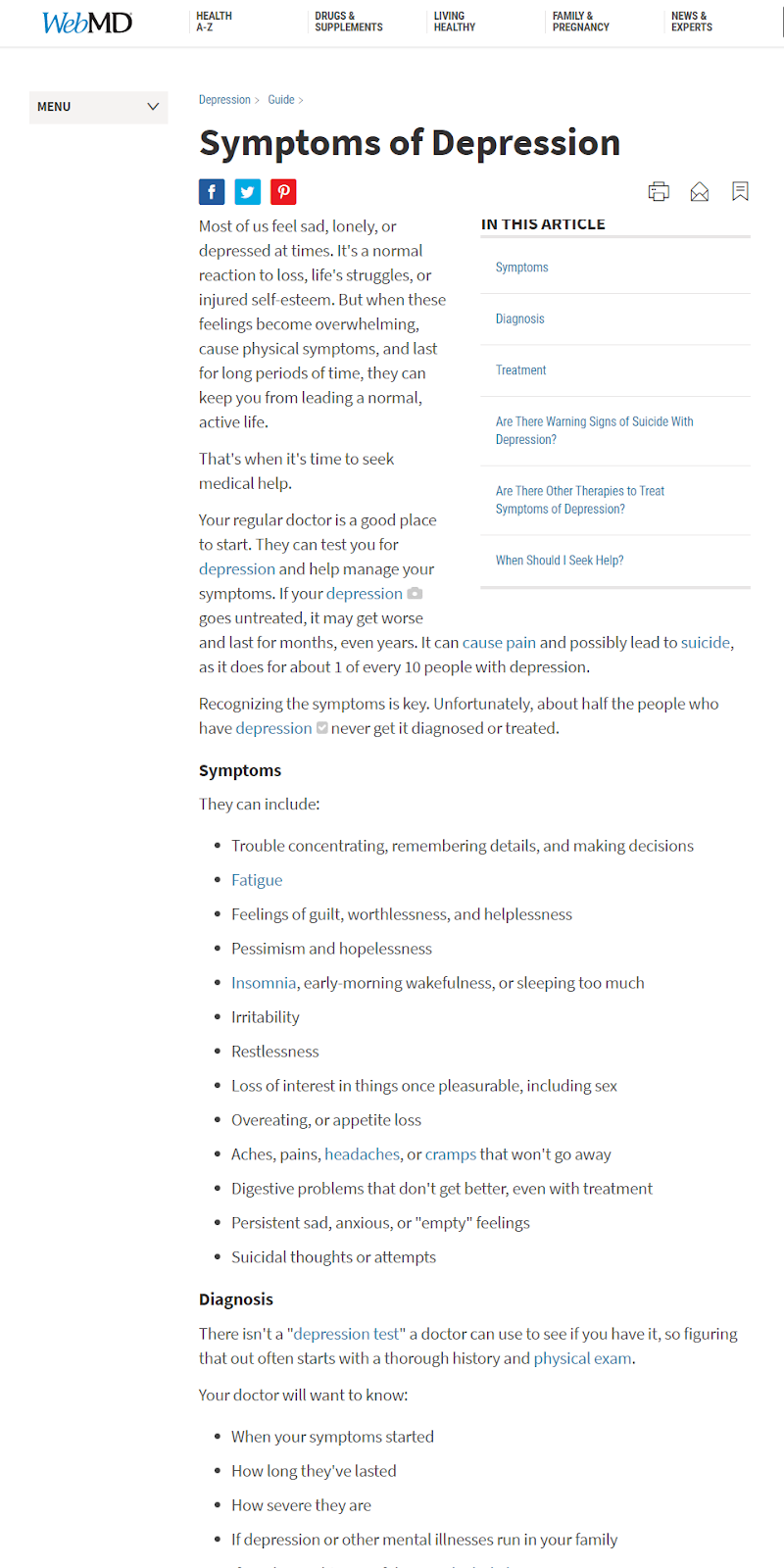
The WebMD, in contradistinction to the MHA page, speaks to the “plain meaning” of the query’s intent… how can you tell if you’re suffering from depression?
Aside from that, the WebMD page offers a bit more in terms of substance. While it doesn’t go into great detail per se, the WebMD page does offer a pretty comprehensive list of items.
Compare that to the MHA page which, if you read it, is a bit thin and lacks tremendously in offering much of any details (even a basic list as seen on the WebMD page).
The Moral of the Story: Relevancy is a two-pronged equation (at minimum). It requires the content to be topically focused on the one hand as well as substantial on the other. You can’t be relevant if the content your page offers is overly precursory. A page has to not only have the right topical content on it but that content must have something to offer the user. This is not a new point, far from it. It’s just interesting to watch it unfold on the SERP.
6. Skin Cancer Detection
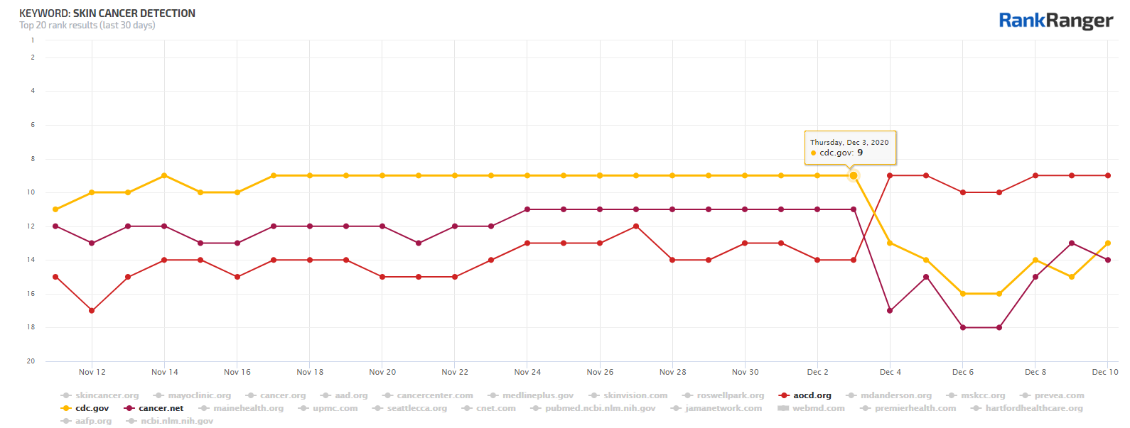
Winner:
Loser(s):
I’ve saved the best for last. This is my favorite example that I came across when diving into the December 2020 Core Update.
I mean, for crying out loud, we’re talking about the CDC losing rankings in favor of a .org domain I never heard of.
How could this be?
Let’s understand the intent of the query. If I were searching for this it would be because I found something on my body that I thought might be skin cancer. If I could be so bold, I would imagine that this is why most of us would search for this term.
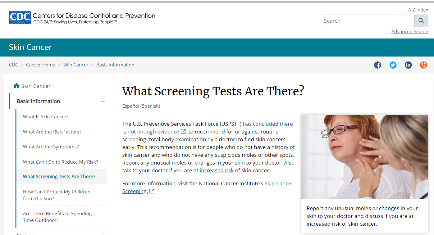
I wouldn’t, and again I imagine most people in most instances wouldn’t search for this in order to understand if regular screening is officially recommended or not.
Yet, that is what the CDC page is about:
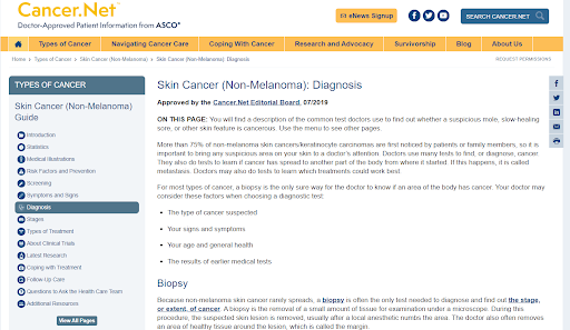
I hate to make assumptions, but I would also think that someone running this query is most likely not interested in the common tests and methods doctors use to determine if skin cancer is present. Yet, this is what the page from Cancer.net focuses on:
Again, I would search for this term if I saw something weird on my body that made me think “Holy crap, do I have skin cancer?”. The page from the AOCD is entirely made for people on the verge of freaking out at the possibility of having skin cancer:
To me, when you see this page relative to the pages from Cancer.net and the CDC is painfully obvious why this page got the ranking boost.
The Moral of the Story: Again, I think what has transpired here is painfully obvious. Google has looked past the immediate authority of some of the pages here and has more heavily considered how relevant the content is to the query. As with the cases I have shown earlier, Google is rewarding content that speaks in a highly-focused way to the intent and nature of the query.
What Was the December 2020 Core Update About?
Are you expecting a one-liner that definitively characterizes the December 2020 update? You’re not going to get one from me.
This update, like any other, certainly included a whole plethora of different “algorithmic considerations” and themes.
That said, from where I sit, while other core updates did things to help put the most authoritative content at the top of the SERP, this update seemed to me as being more about pure relevancy.
Updates of the past have done things to weed out sites using a marketing tone within YMYL informational content or have rewarded sites that put the right content ahead of their affiliate pursuits. All of that, while part of relevancy, speaks more to a need for something authoritative at the top of the SERP.
Seeing so many .gov pages drop in favor of pages from sites like Healthline or WebMD seems to point to the update rewarding relevancy to the nth degree. Perhaps Google felt as if it had “authority” at the top of the SERP in order, paving the way for a focus on relevance? Who knows. All I can say is that I personally have not seen such a strong focus on pure relevance on page one of the SERP.
Content Creation Takeaways
Practically speaking, I think the era of broadly reaching pages is quickly coming to an end. I think that has been the case for a while. However, seeing Google pull pages off page one of the SERP because they deal with multiple subtopics is a new level, at least for me. It shows that you have to create content that talks about one topic and one topic only (unless the keyword reflects a specific desire for a broader survey of a topic).
I wonder if the idea of having one ultimate guide so as to win numerous keywords should be replaced with multiple posts where each post deals with one specific topic or subtopic. (If you do that, please don’t create thin content, that is not what I am advocating for.)
It’s a rather logical concept. As Google gets better at understanding content it is going to prefer highly-focused content around a specific topic to that which is of a more broad nature unless the query specifically shows intent for a general survey of a topic.


![YMYL Websites: SEO & EEAT Tips [Lumar Podcast] YMYL Websites: SEO & EEAT Tips [Lumar Podcast]](https://www.lumar.io/wp-content/uploads/2024/11/thumb-Lumar-HFD-Podcast-Episode-6-YMYL-Websites-SEO-EEAT-blue-1024x503.png)
