Elementor vs Beaver Builder – which is right for you?
They are both excellent page builders. But they cater to different needs.
See how they compare on 7 key criteria and decide which one is right for you.
This article contains affiliate links and I will receive a small commission if you make a purchase from this page

Both page builders have good user interfaces and both have all the functionality you need to build smart looking websites that deliver great user experience.
Elementor is your best option if:
- you only have one or two websites (Elementor Pro)
- you want a fully functioning page editor without spending a cent (Elementor Free)
- you want a page builder with more functionality (e.g. a popup builder)
Beaver Builder is your best option if:
- you are a developer and you build websites for clients
- you plan on using the page builder on more than three websites (Beaver Builder can be used on unlimited websites).
- you want a white label option (i.e. an end product that you can sell to your client with no branding).
In this Elementor vs Beaver Builder review, I’ll compare these two page builders side-by-side on seven key criteria:
- Interface
- Design Options
- Responsive Design
- Templates
- Popup Builder
- Theme Builder
- Pricing
What is the difference between Beaver Builder and Elementor?
Elementor gives you more features and design options than Beaver Builder. And for many people, that makes Elementor a better option than Beaver Builder.
But Beaver Builder allows you to do a lot more core editing (for example creating layouts or modifying existing layouts). And that makes Beaver Builder a better option for WordPress developers.
Elementor vs Beaver Builder: Side-By-Side Comparison
Here’s my detailed comparison of the two page builders against seven key criteria:
- Interface
- Design Options
- Responsive Design
- Templates
- Popup Builder
- Theme Builder
- Pricing
Elementor vs Beaver Builder: Interface
The interface is a good place to start our comparison because it’s where you’ll be spending a lot of your time.
Elementor Interface
When you create a new blog post with Elementor, your screen will be divided in two: the main area where you get a live preview of your blog post and a fixed left sidebar containing elements that you can drag and drop into your blog post.
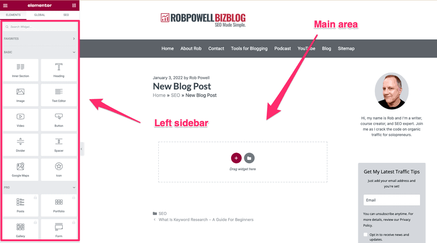
Elementor is based on three kinds of elements:
Sections are top-level elements: they contain columns and widgets.
Columns are second-level elements: they fit inside sections and they contain widgets.
Widgets are the third level of the building block hierarchy: they are responsible for the actual content on your page. Widgets include things like headers, text, images, video, etc.
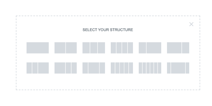
Clicking on the plus sign in the main editing area gives you options for adding sections to your blog post.
This is where you create the layout or structure of your blog post. You can choose various combinations of columns and column widths:
Once you’ve chosen the layout for that section, you then have the option to add elements from the left sidebar:
You can then drag an element, such as a text block, onto your page:
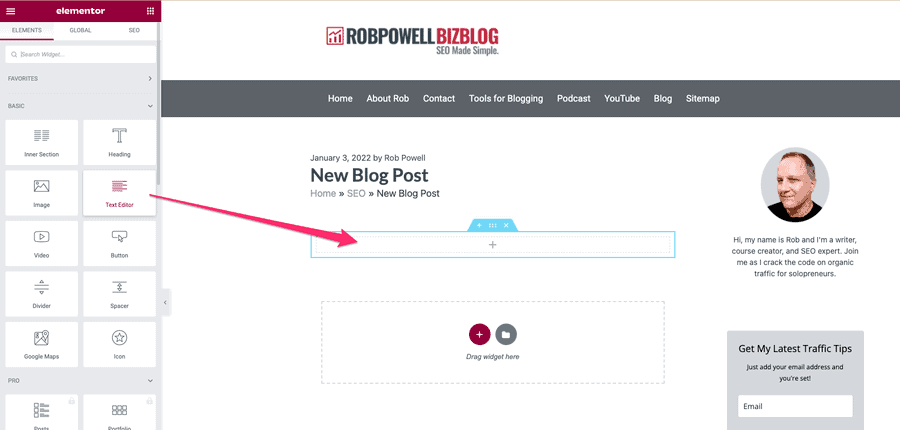
To add another element, such as an image, simply repeat the process.
It’s an easy-to-use interface and feels pretty intuitive.
As you would expect from a leading pager builder, Elementor has inline text editing, meaning that you can type directory into the editing area of your page.
The fixed left sidebar contains all the WordPress widgets that you need to format and create your blog post.
A very useful feature in Elementor is the right-click navigation. When you right-click on any element, a drop down pops up offering you various editing options:
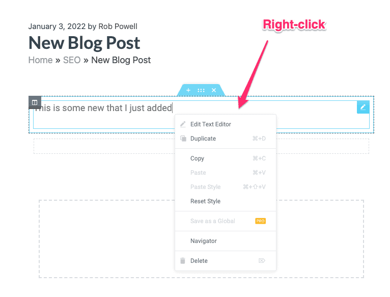
This right-click menu gives you the option to quickly duplicate an element or change its styling.
Another useful feature is the ‘navigator’. This is a tree panel providing easy access to the design hierarchy.
The navigator allows you to see exactly which design feature you are working on and quickly jump to another feature in your page. In Elementor Pro, the right-click menu also allows you to save an element as a template.
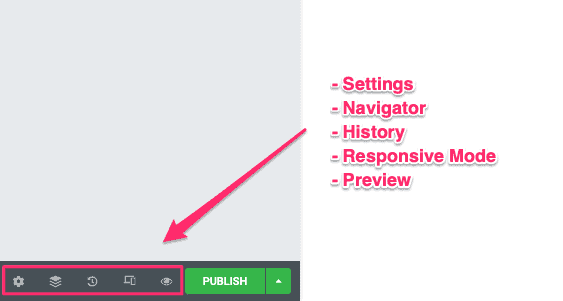
In the bottom left of the interface, there are buttons that give you access to some useful tools: settings, navigator, history, responsive mode, and preview:
Beaver Builder Interface
The Beaver Builder interface works a little differently from Elementor’s.
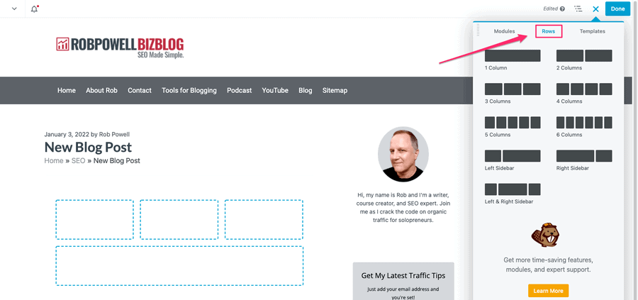
When you start a new blog post, the entire screen is your preview. In the top right corner is a blue plus sign. Click on that and you get a dropdown menu where you can add modules, rows, and templates:
The terminology in Elementor and Beaver Builder is slightly different.
What Elementor calls ‘widgets’, Beaver Builder calls ‘modules’.
But they are exactly the same thing. In both editors, they are the building blocks you use to create your web page.
The rows create the layout of your page and the modules create the content of your page.
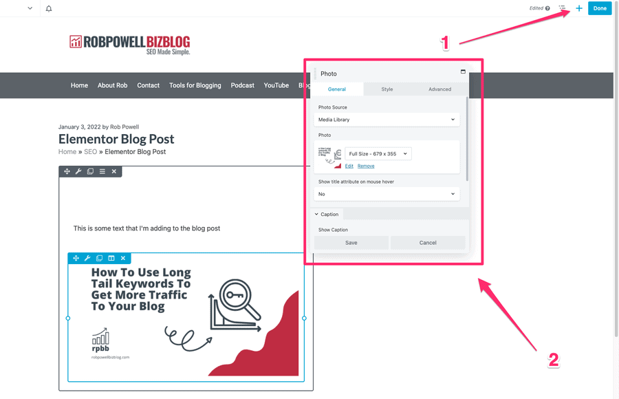
When you add a module to your page, a popup appears that allows you to control the content and styling of that module. For example, here’s a text module:

You can type your text into the popup or directly into the page itself.
You can drag these module popups around the screen and place them wherever you want. This makes Beaver Builder a lot more flexible than Elementor which uses a fixed left-side menu.
Rows and columns also have pop ups that allow you to control their style.
The workflow for building your page in Beaver Builder is:
- Click the plus sign in the top right corner to add either a row or a module
- Use the pop up for that row or module to format the element the way you want it
As with Elementor, Beaver Builder gives you a tree panel that shows you the hierarchy of design elements and identifies the element you are currently working on:
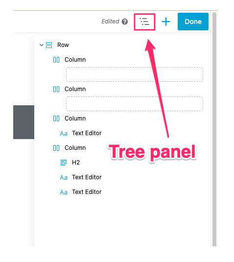
Interface – Which Is Better?
Beaver Builder has a more fluid and flexible interface than Elementor. With Elementor you have a fixed, left menu. But with Beaver Builder, you have editing pop ups that you can move around the screen. In my opinion, Beaver Builder’s interface is more user-friendly.
On the other hand, Elementor gives you right-click access to important functions like copy/paste (Beaver Builder doesn’t have this).
Also, Elementor gives you 57 different widgets compared with Beaver Builder’s 37.
So which has the better interface?
It comes down to Beaver Builder’s popup menus versus Elementor’s fixed left menu. Personally, I prefer a fixed menu – Beaver Builder’s movable popups can be become distracting.
On the issue of interface it’s a draw – it depends what your personal preference is.
Comparison of Interface features
|
Fluid and flexible interface |
Elementor vs Beaver Builder: Design Options
What options does each builder give you for designing your pages? How granular are the controls? Do they give you advanced design options such as mouse animations and motion effects?
That’s what we’ll look at in this section.
Design Options – Elementor
The design of your pages comes down to the widgets or modules that create the content itself. Elementor gives you 57 different widgets divided into ‘basic’ and advanced’:
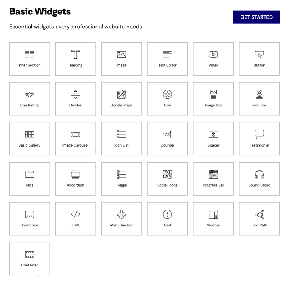
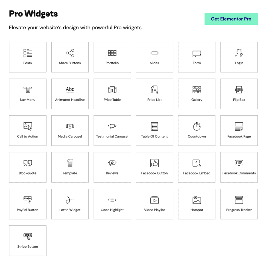
Elementor gives you the ability to control every aspect of your layout and content.
This includes things like column width, margin, padding, font face, color, size, and text-shadow. You also have full control over the background settings.
With Elementor Pro, you get access to even more advanced design options. For example, you can add CSS to individual elements, use absolute or relative positioning, and use sitewide settings that guarantee consistent design across your entire site.
Elementor also offers a powerful toolset for creating scrolling and mouse animations, including advanced motion effects.
These effects include:
- vertical scroll (parallax effect)
- horizontal scroll
- transparency
- blur
- rotate
- scale
- mouse track
- 3D tilt
Design Options – Beaver Builder
Beaver Builder gives you 37 different modules, which is less than the 57+ widgets that Elementor offers:
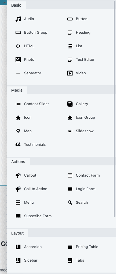
Beaver Builder gives you all the core design options you would expect in a leading page builder. You can apply design options to rows, columns, and modules.
For rows and columns, you have two design tabs: style and advanced. For modules, you have three design tabs, general, style, and advanced.
Also, Beaver Builder has recently added the ability to apply CSS to individual design elements.
Design Options – Which Is Better?
One difference between Beaver Builder and Elementor is that Beaver Builder inherits your theme’s fonts and colors by default. In Elementor, you have to disable Elementor’s default colors and typography if you want to use your theme’s fonts and colors. On this issue, I prefer Beaver Builder’s approach.
However, Elementor Pro gives you many more design options than Beaver Builder. For example, motion effects and custom positioning are both available in Elementor but not supported in Beaver Builder.
Also, Elementor gives you many more widgets or modules than Beaver Builder.
In terms of design, Elementor is the clear winner.
Comparison of Design Features
|
Design options for rows, columns, and modules |
||
|
Add CSS to individual elements |
||
|
Absolute & relative positioning |
||
|
Inherits theme fonts and colors by default |
Elementor vs Beaver Builder: Responsive Design
Responsive design is an approach to web design that aims to make web pages render well on a variety of devices, including desktop, tablet, and mobile.
How do these two page builders compare in terms of responsiveness?
Elementor – Responsive Design
Elementor’s designs are automatically device-responsive, but you also have full control over responsive design settings.
At the foot of the panel toolbar are the responsive preview controls. These allow you to switch between desktop, tablet, and mobile previews.
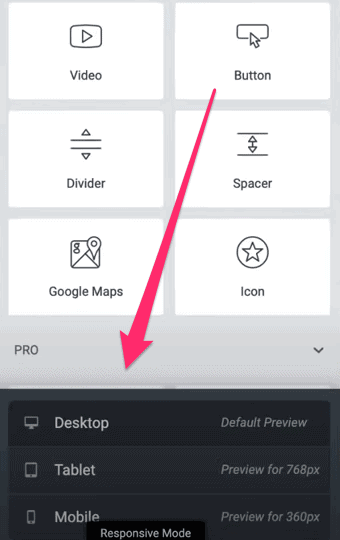
You can see these same options in the settings for any given widget, column, or section.
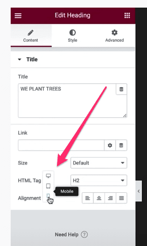
Some elements just don’t display well on mobile. And that’s why Elementor also gives you the option to hide elements on desktop, tablet, or mobile.
Beaver Builder – Responsive Design
All the designs on Beaver Builder are responsive by default. But as with Elementor, you can view your page in different viewports (desktop, tablet, and mobile) and make adjustments that only affect how the page displays on a particular device.
In Beaver Builder you can do this for any row, column or module that displays a device icon:
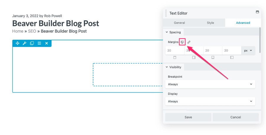
Beaver Builder, like Elementor, lets you define the breakpoints for responsive display.
And as with Elementor, Beaver Builder has a preview mode that allows you to view your page on different device sizes.
Responsive Design – Which Is Better?
Both page builders allow you to adjust your designs so that they display properly across all devices. On this issue, there’s very little to choose between the two platforms, so this is a draw.
Comparison of Responsive Design
|
Automatically device-responsive |
||
|
Full control over responsive design settings |
||
|
Define breakpoints for responsive display |
||
|
Switch between desktop, tablet, and mobile previews |
||
|
Hide elements on desktop, tablet, or mobile |
Elementor vs Beaver Builder: Templates
Templates can save you a ton of time. These can be templates that have been pre-designed for you or they can be your own templates that you create from scratch.
Either way, the ability to drop templates into your web pages is a game changer. It improves your workflow and increases your productivity.
Let’s see which page builder has better templates.
Elementor Templates
When you start a new post or page in Elementor, the first thing thing you see is an option to use a template:
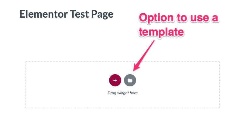
Elementor comes with two kinds of ready-made templates: blocks and pages. Block templates are professionally designed, ready-to-use widgets that you can drop into a page.
For example, here’s an ‘About’ block that I’ve dropped into a new page:
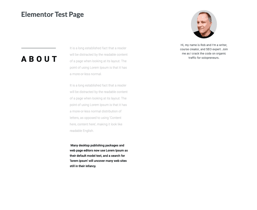
You can customize any block template so it looks the way you want it and then save it to be used over and over again.
This will save you a lot of time.
Page templates are designer-made page layouts. You can search the template library for designs that fit your niche:
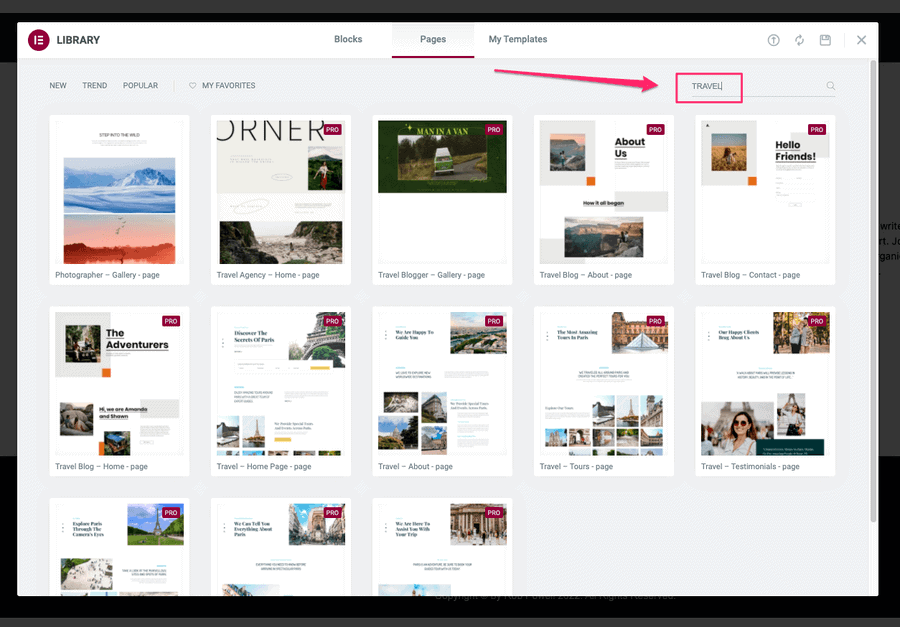
Once you’ve chosen a page layout template, you can customize it and save it as a template that you can use again.
Elementor Pro gives you access to over 40 page templates and over 160 block templates.
WebKits are themed sets of templates that help you build an entire website for a particular industry or niche. Elementor currently offers the following WebKits:
- Beauty & Hair
- Blog
- Business & Services
- Creative
- Ecommerce
- Education
- Events & Entertainment
- Fashion
- Food & Drink
- Health & Wellness
- Music & Bands
- NGO
- Portfolio & CV
- Retail Stores
- Seasonal
- Sports & Fitness
- Technology
- Travel & Tourism
Beaver Builder Templates
Beaver Builder offers two kinds of templates: landing page templates and content page templates (but no widget or module templates).
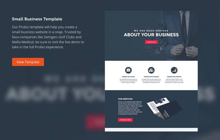
Landing page templates are impressive-looking standalone pages designed to convert:
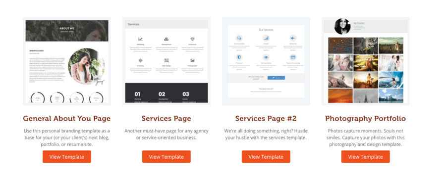
Content templates are regular website pages, such as ‘About’, ‘Contact’, and ‘Portfolio’ pages:
In Beaver Builder (as with Elementor) you can customize these templates and then save them to your template library.
Templates – Which Is Better?
This contest goes to Elementor because it offers widget or block templates whereas Beaver Builder doesn’t.
Elementor vs Beaver Builder: Popup Builder
This is a feature that is only available in Elementor – at time of writing there is no ability to create popups in Beaver Builder.
The Popup Builder is included in Elementor Pro and it uses the same left-side panel that you use to create and edit pages and posts:
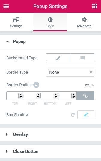
There are a variety of different popup templates to choose from, including email opt-in forms, promotional banners, and upsells:
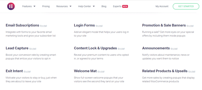
You can use a ready-made popup template or you can build your popup from scratch.
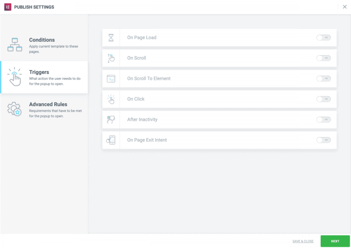
Elementor’s Popup Builder gives you all the advanced settings you need to control the way your popup behaves, where it appears, and when:
Comparison of Popup Builder
Elementor vs Beaver Builder: Theme Builder
Elementor and Beaver Builder both give you the ability to design not just individual pages but an entire website. They do this through a ‘theme builder’ that allows you to create standard elements, like headers, footers, single posts etc. These elements are then used across your website to create a theme that contains your branding.
So which builder has the better theme builder: Elementor or Beaver Builder?
Elementor Theme Builder
Elementor’s Theme Builder lets you design an entire site. It uses the same interface you use to create pages and posts.
The Theme Builder consists of a number of ‘site parts’ such as header, footer, single page, single post, etc:
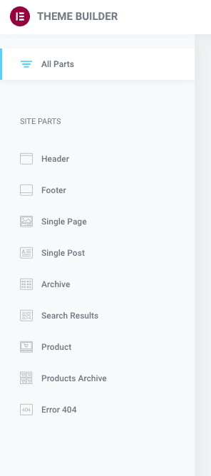
There are templates for each of these site parts which you can customize:
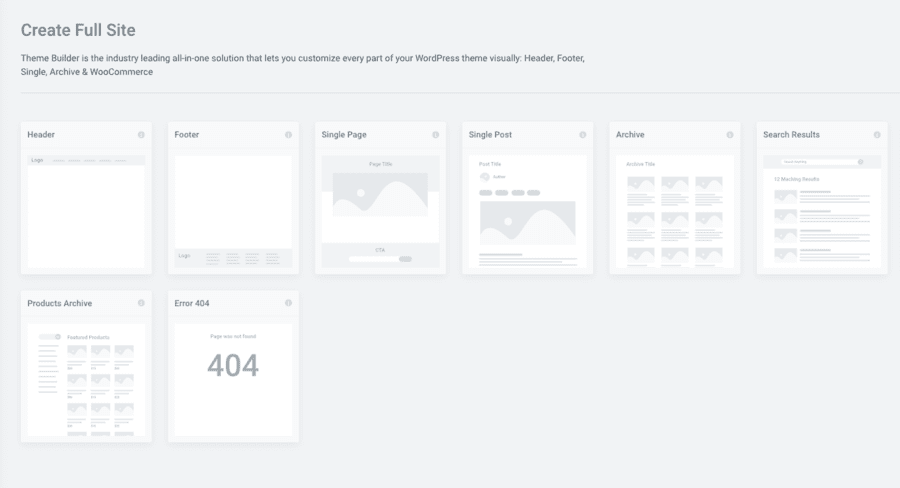
Once you have customized a site, you can control where it appears on your site. For example, you could design a ‘single post’ layout that only appears for posts by a particular author.
Developers will be interested in Elementor’s ‘dynamic tags’. These allow you to display content dynamically, using third-party widgets.
Any field that has the dynamic tags icon next to it can be populated with dynamic content:
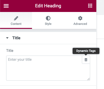
As well as templates for individual site parts, Elementor also offers templates for entire website designs. These are called ‘website kits’ and there are over 60 of them included in Elementor Pro.
Elementor’s Theme Builder works with any WordPress theme – so no need to worry about compatibility.
Beaver Themer
Beaver Builder also has a theme builder, called Beaver Themer. However, Beaver Themer is not included with the premium version of Beaver Builder – it is a separate add-on.
Beaver Themer uses the same interface that you use in Beaver Builder to create individual pages and posts.
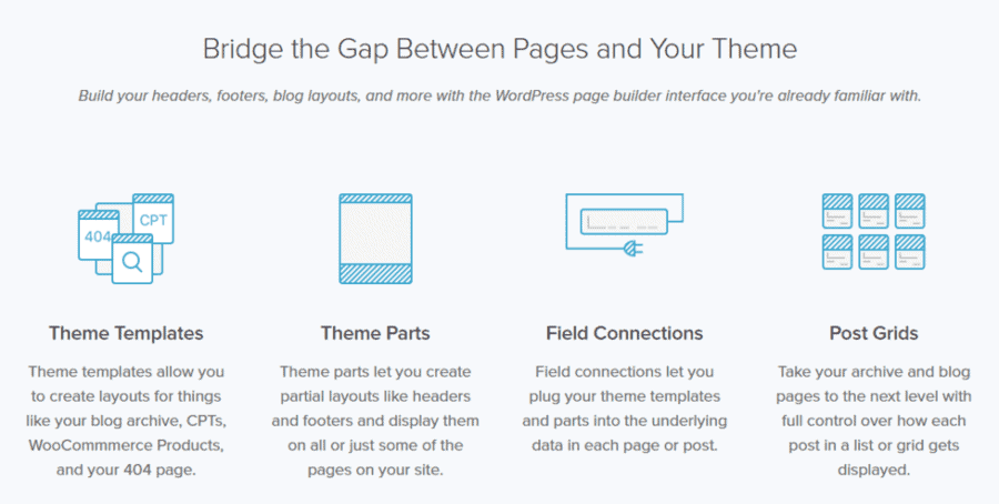
You can use Beaver Themer to design any sitewide element, including the header, footer, archive, single post, 404 pages, and so on.
Beaver Themer uses WordPress hooks to inject content at specified places across your website.
Beaver Themer’s rules-based customization gives you considerable power and flexibility in the way you customize your website. It uses conditional logic to fine-tune exactly where and when Themer layouts or parts of Beaver Builder layouts are displayed.
Theme Builder – Which Is Better?
These two theme builders do much the same thing: they allow you to create sitewide templates that give your website consistent branding, appearance, and layout.
Both builders allow you to customize your entire website using your own templates. They both offer powerful rules-based options for determining where templates will appear across your site.
The main difference between the two theme builders is not in what they do but in the pricing.
Elementor’s Theme Builder is included with Elementor Pro. Beaver Themer, on the other hand, is not included in Beaver Builder Pro: it’s an add-on that costs an extra $147.
In my mind Elementor is the clear winner here, simply because their theme builder is included in the Pro version of their page builder.
Comparison of Theme Builder
Note: Beaver Builder has a theme builder but it is a separate product (not included)
Elementor vs Beaver Builder: Pricing
There are some important differences in the pricing of these two page builders. And you’ll need to take into account these differences when choosing between the two builders.
Elementor Pricing
Elementor has three tiers in its pricing:
- Essential: $49 p/year (1 site)
- Expert: $199 p/year (25 sites)
- Agency: $399 p/year (1000 sites)
Beaver Builder Pricing
Beaver Builder has four tiers in its pricing:
- Standard: $99 p/year
- Pro: $199 p/year
- Agency: $399 p/year
- Ultimate: $546 p/year
All four tiers can be used on unlimited sites and they renew yearly with a 40% discount.
Beaver Builder Pros and Cons
Elementor Pros and Cons
Should you use Elementor or Beaver Builder?
Choosing between Elementor and Beaver Builder is not easy as they are both excellent drag-and-drop page builders.
But in the end, you do have to make a choice. So here is a summary of the pros and cons of each page builder.
Styling and responsive design options
If you want as many advanced styling and responsive design options as possible, then Elementor is the best choice.
Elementor Pro gives you more features than Beaver Builder – in virtually every area of comparison. Elementor gives you many more stylistic options than Beaver Builder and that’s why web designers prefer it over Beaver Builder.
Content blocks
Elementor gives you more content blocks and more templates than Beaver Builder. Another nice thing about Elementor Pro is that whichever plan you choose (Essential, Expert, or Agency) you get all the features. They don’t limit the features according to which plan you sign up for.
Free plan
If you are on a tight budget, then Elementor is the obvious choice because the free version of Elementor has far more features than the free version of Beaver Builder.
Intuitive interface
Beaver Builder has a more fluid and flexible interface than Elementor. The editing pop-ups that you can move around the screen make it easier (and faster) to use than Elementor.
But Beaver Builder doesn’t have as many features as Elementor. In Beaver Builder, the side panel loads the entire editing menu on one screen. In Elementor, you have to scroll down to see all the editing options.
Multiple websites
The choice between the two page-builders starts to become easier once you have more than three websites.
Using Beaver Builder on unlimited sites costs $99 a year, which is the price of using Elementor on just three sites. If you need a page builder for more than three sites, Beaver Builder is the better choice. And that’s why Beaver is popular amongst developers.
Another reason why developers will prefer Beaver Builder is the ‘white labelling’ options in the Agency version of Beaver Builder. In the Agency plan you can remove the Beaver Builder branding from the software. This is a useful feature for developers – without it, users may look at your completed product and think you just slapped a few plugins and a theme together.
Elementor Pro and Beaver Builder are similarly priced up to three websites. But once you go beyond three websites, Beaver Builder becomes significantly cheaper. Also, Beaver Builder renews with a 40% discount that continues year on year. With Elementor, you’ll be paying the same price to renew every year.
Conclusion
Hopefully this Elementor vs Beaver Builder comparison has helped you decide which one is right for you. If not, here are some final thoughts that may help you choose.
If you are a small business owner with three websites or less, your best choice is Elementor. You get a feature-rich builder with a lot more styling and design options for less than half the price of Beaver Builder.
But if you need a page builder for more than three websites, then Beaver Builder is your best option because all three tiers can be used on unlimited sites.
Basically, it comes down to this: Elementor gives you more features and design options but Beaver Builder lets you use their page builder on more sites.
If you still can’t decide, why not try them out? They both have free versions. You can download the free version of Beaver Builder from the WordPress repository. And the free version of Elementor is available here.


