Welcome back to this case study on doing a lift and shift from Drupal to Sitecore 10.2 and SXA. In the previous article we setup a theme, a custom grid and a base component. This removed all the extra divs and containers normally injected by SXA. In this article, we’ll use the html from drupal to create our components in SXA.
Solution Setup
I created one project in the solution called Feature.Components. I did not want to add a new project to the solution for each component. This allowed us to keep all the config, serialization files and cshtml files related to components in once place. It also sped up development by minimizing the amount of work to do in Visual Studio. We could do the majority of our work in Sitecore itself.
Creating Components
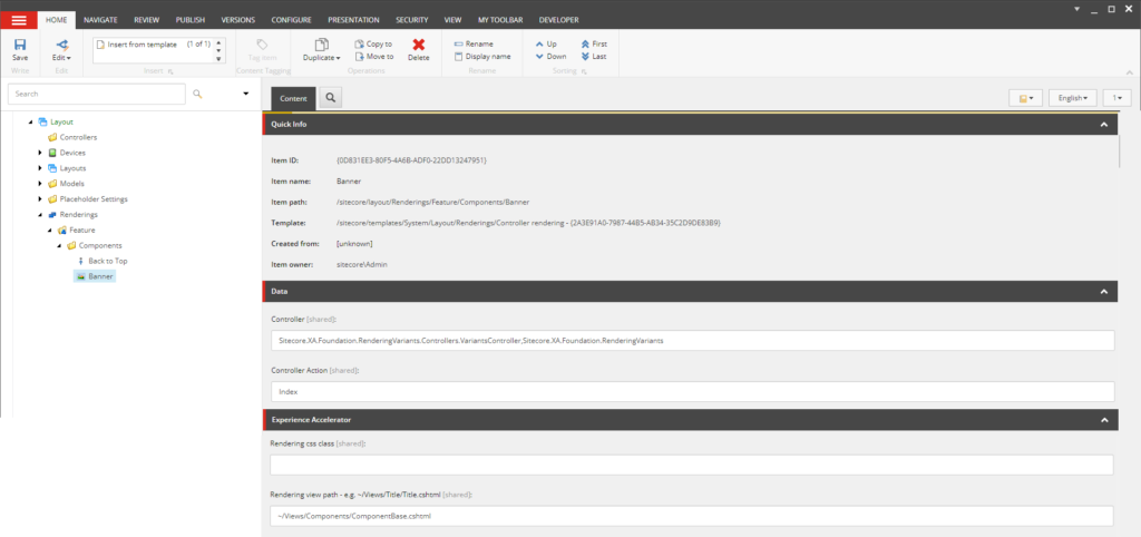
We put all the components in one folder in the content tree, /sitecore/layout/Renderings/Feature/Components. We are using unicorn for item serialization. Each new component we created was automatically serialized. Remember from the previous article that each component (rendering) will call the default sxa controller Sitecore.XA.Foundation.RenderingVariants.Controllers.VariantsController,Sitecore.XA.Foundation.RenderingVariants, the index controller action, and use the shared ~/Views/Components/ComponentBase.cshtml for the rendering view base.

Component definition item
We can customize each component to use its own parameters template, datasource location, datasource template, compatible renderings, experience editor buttons, etc.
Creating Components from Drupal
The process of creating components was super-fast and easy!
- View the live site
- Use dev tools to inspect an element
- Copy the html to scriban templates in rendering variants leaving the classes and structure in tact
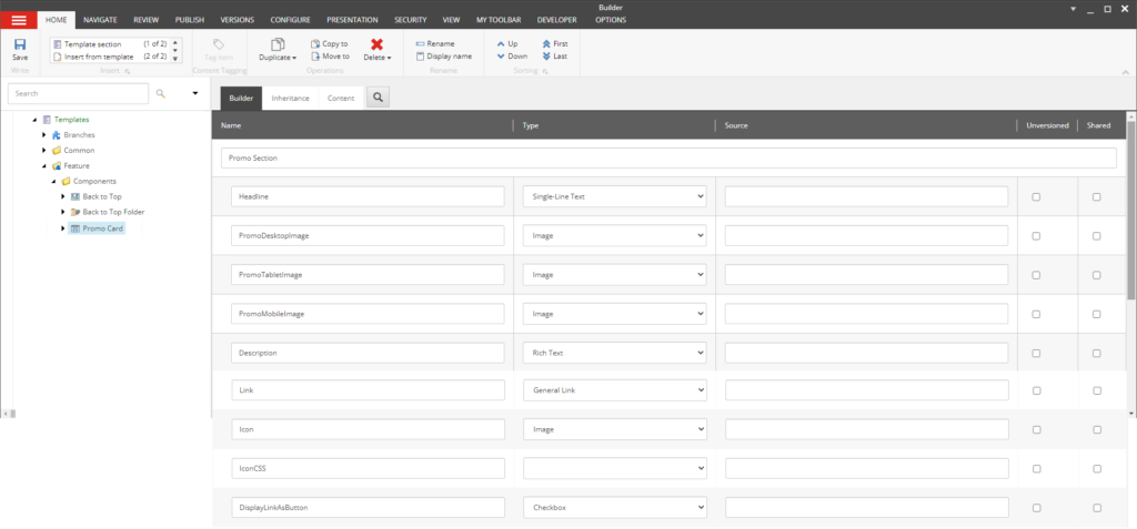
- Create a datasource template
- Update the scriban template and replace content with matching fields from the datasource template
- Update the scriban and replace repeatable blocks with placeholders
Drupal creates its own hierarchy of html. So we had to be careful how much of the html structure we grabbed. We only want the html related to the component we are building. Let’s look at a couple of examples!
Example Components
This component is really two components. We want to make a media card component and a grid component that can hold the cards.

Example media grid with media cards
<div class="paragraph paragraph--type--tile-group paragraph--view-mode--default hero-tiles-section hero-tiles-section--3-items js-hero-tiles-section" role="region" aria-label="Carousel">
   <div class="paragraph paragraph--type--tile paragraph--view-mode--default hero-tiles-section__l-col hero-tiles-section__l-col--hero" style="">
      <div class="media-card hero-tiles-section__hero-media-card">
         <figure class="media-card__img-container custom-object-fit">
            <picture>
               <img class="media-card__img lazyload" loading="lazy" src=" alt="Delight Case">
            </picture>
         </figure>
         <div class="media-card__text-container">
            <h2 class="media-card__title">
               New Bakery Solutions: DELIGHT!
            </h2>
            <div class="media-card__description">
               <div class="field field--name-field-tile-summary field--type-string-long field--label-hidden field__item">
                    Create a Bakery Destination for Your Shoppers.
                </div>
            </div>
            <a href=" class="btn btn--details media-card__hero-btn hero-top-tiles-section__hero-btn">Explore Solutions</a>
         </div>
      </div>
   </div>
   <div class="paragraph paragraph--type--tile paragraph--view-mode--default hero-tiles-section__l-col hero-tiles-section__l-col--tile" style="">
      <div class="media-card media-card--with-photo-bar hero-tiles-section__tile-media-card">
         <picture>
            <img class="media-card__img lazyload" loading="lazy" src="/sites/default/files/MicroDSMonoblockHero.png" alt="Monoblock Promo">
         </picture>
         <div class="photo-bar media-card__photo-bar photo-bar--pna-blue-bar">
            <h3 class="photo-bar__title">
               Propane Monoblock (R-290)  All-in-One Walk-In Cooler and Freezer Solution
            </h3>
            <a href=" class="btn btn--details photo-bar__btn" target="_blank" rel="noopener">
               Learn More
               <svg class="feather icon feather-chevron-right " aria-hidden="true">
                  <use href="
               </svg>
            </a>
         </div>
      </div>
   </div>
   <div class="paragraph paragraph--type--tile paragraph--view-mode--default hero-tiles-section__l-col hero-tiles-section__l-col--tile" style="">
      <div class="media-card media-card--with-photo-bar hero-tiles-section__tile-media-card">
         <picture>
            <img class="media-card__img lazyload" loading="lazy" src="/sites/default/files/storeconect.jpg" alt="">
         </picture>
         <div class="photo-bar media-card__photo-bar photo-bar--green-bar">
            <h3 class="photo-bar__title">
               StoreConnect automatic leak detection
            </h3>
            <a href=" class="btn btn--details photo-bar__btn">
               Learn More
               <svg class="feather icon feather-chevron-right " aria-hidden="true">
                  <use href="
               </svg>
            </a>
         </div>
      </div>
   </div>
</div>
Media Card Grid
For the media card grid, we want to remove the html for the cards and replace it with Sitecore dynamic placeholders.
<div class="paragraph paragraph--type--tile-group paragraph--view-mode--default hero-tiles-section hero-tiles-section--3-items js-hero-tiles-section" role="region" aria-label="Carousel">
   <div class="paragraph paragraph--type--tile paragraph--view-mode--default hero-tiles-section__l-col hero-tiles-section__l-col--hero" style="">
      {{sc_placeholder 'mediaCardTilePlaceholder*'}}
   </div>
   <div class="paragraph paragraph--type--tile paragraph--view-mode--default hero-tiles-section__l-col hero-tiles-section__l-col--tile" style="">
      {{sc_placeholder 'mediaCardTilePlaceholder*'}}
   </div>
   <div class="paragraph paragraph--type--tile paragraph--view-mode--default hero-tiles-section__l-col hero-tiles-section__l-col--tile" style="">
      {{sc_placeholder 'mediaCardTilePlaceholder*'}}
   </div>
</div>
Media Card
For the media card, we want to replace each piece of content with the data from the datasource template.

Media card datasource template
<div class="media-card hero-tiles-section__hero-media-card">
   <figure class="media-card__img-container custom-object-fit">
      <picture>
         <img class="media-card__img lazyload" loading="lazy" src="
      </picture>
   </figure>
   <div class="media-card__text-container">
      <h2 class="media-card__title">
         {{ sc_field i_datasource 'Headline' }}
      </h2>
      <div class="media-card__description">
         <div class="field field--name-field-tile-summary field--type-string-long field--label-hidden field__item">
               {{ sc_field i_datasource 'Description' }}
          </div>
      </div>
      {{ sc_beginfield i_datasource 'Link' [['text', ' '],['class', 'photo-bar__more-link']]}}
          {{sc_link_text i_datasource 'Link'}}
           <svg class="feather icon feather-{{i_datasource.IconCSS.Raw}}" aria-hidden="true">
               <use href="{{i_datasource.Icon.media_url}}#{{i_datasource.IconCSS.Raw}}"></use>
           </svg>
      {{ sc_endfield}}
   </div>
</div>
Sitecore Specific Updates
Of course, you’ll want to make some Sitecore specific updates to your scriban templates.
- Check for null fields
- Check for empty strings before displaying a field (so you don’t get empty html tags or empty links)
- Make any adjustments for editing in experience editor mode
- Add edit frames
- Add logic to get child items or follow links to other items
- Add styles from parameters templates
You can go one step further to make content authoring faster and easier.
- Set insert options on placeholders to allow the appropriate components
- Organize the available renderings into logical groupings (ie: header, content, media, footer)
- Set the datasource locations on the rendering
Conclusion
This process allowed us to create components at an amazingly fast pace! Our components had few UI defects because we copied the html directly. In the next post we’ll look at how we converted the css and javascript to make our SXA components match the drupal site.
Do you need to migrate your site? Reach out to see how Perficient can help you migrate your site.


